With this assignment, the brief was to create a series of reportage illustrations that celebrate aspects of local culture. To start, I took a look at which aspects i most had an affinity with so far and looked at weaving these aspects into any images I would produce.
On reflection, I enjoy working with figures and portraying people, I like drawing buildings and I like visiting festivals and taking in the atmosphere.
I’ve struggled somewhat on this whole part of the course leading to assignment two, my time has just burned away partly through overly stretching one or two of the research points (some bad time management there on my part) and the usual family dramas which everyone seems to have these days, so i felt I couldn’t throw nearly as much time as I would have liked into this assignment in terms of getting out and about.
I tried to do what I could regardless, and the time I did spend out and about was a positive and I managed to get some decent studies.
Anyway, after a few trips out and about for the architectural exercise, I decided I would settle on york rather than Leeds, simply because York is always a nice experience when it comes to drawing people and buildings.
I think a tourist board celebration of York would almost certainly feature the commerce and shopping experience and the city’s historical aspect through centuries of different rule and architecture. In my opinion these are likely to be larger attractions than say the night / student life of neighbouring Leeds : on the flip side of this, I believe York offers a much better shopping experience than Leeds, solely because there are many more smaller / individual traders of interest now, rather than the vast metropolis of soulless department stores and malls which Leeds now has.
I decided I would concentrate on trying to capture the people and places type scenario while trying to portray the historical aspect as much as possible.
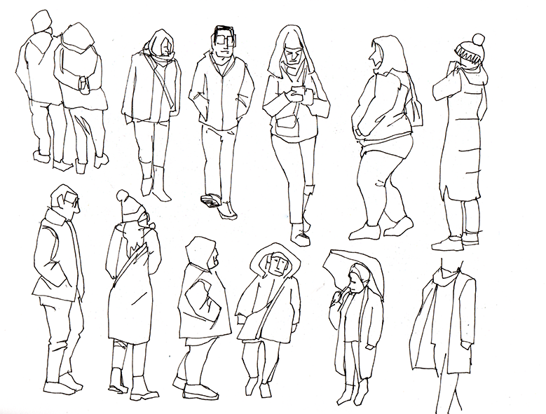
The first thing I decided to do was create a few studies of people going about their business : I found this approach worked well for me when I was doing the sketchbooks reportage section, as sometimes trying to get everything down in a sketch in one go meant I sometimes missed out interesting groups, individuals or poses. Doing this meant if I needed to, i could use these studies to fill in any visual gaps I may have later.
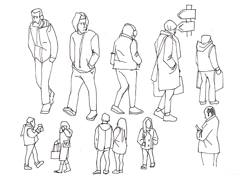
Sometimes I sketch the top half of a person then cheekily sketch the bottom half of the next person coming along. This tends to work good in colder weather as many people have their hands in their pockets, so a mismatch between arm/leg swing isn’t apparent. The contour / blind contour exercises from the sketchbooks module were very insightful for these studies.
I spent some time getting down sketches of the main shopping areas where there tend to be large concentrations of people.
The shambles is probably the most famous street and tends to be packed solid with tourists taking selfies and photographs of each other with the impossibly narrow buildings in the background, so drawing here would be too much of a challenge (just about all of the paintings and drawings of this street in the local galleries are dawn, dusk or evening scenes, when there are hardly any people there).
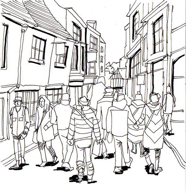
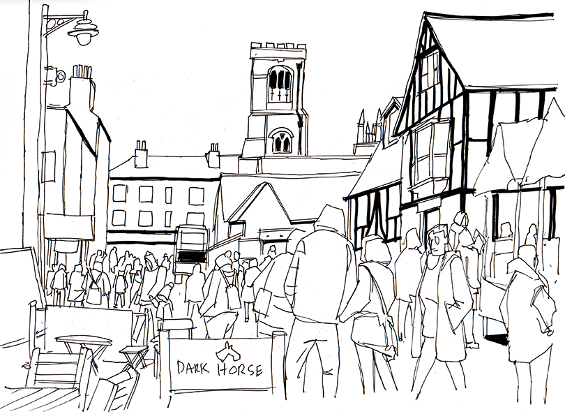
The first sketch here was of Goodramgate, this is a long busy street with a narrow street. This always makes it crowded on a weekend and near christmas this quickly becomes congested and navigating one end to the other becomes a slow task.
The buildings here are very old in places and they have sunken floors and windows which adds a really nice olde worlde charm to them, everything is off kilter. I ended up with an exceptionally tall figure at the front of this sketch which makes it feel Alice in Wonderland-esque!
Here, i managed to do a sketch of Coney street, which is where all the main larger department stores are situated.
The river Ouse is just on the right at the other side of these buildings, and this street has flooded in the past : when you consider the alleys that lead to the river are all sloping downhill, it’s not difficult to see how high the river reaches to flood up here.
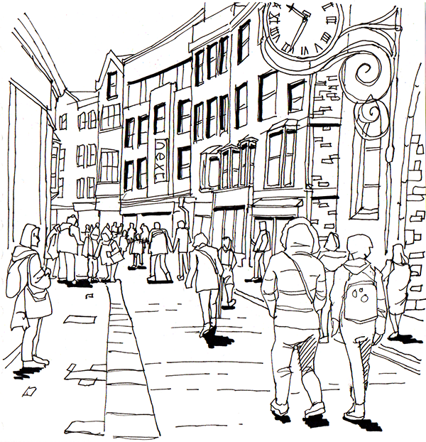
While the rest of the clan were perusing the market stalls, I parked myself on a cafe chair and sketched this picture of the Market street leading to the little Shambles. The minster spires are just visible on the right. This area always has heavy footfall from shoppers and the addition of an outdoor world food market has proved a really successful draw for tourists and day trippers and the fact that it’s situated off the main shambles where the Harry Potter world shops are probably contributes as well.
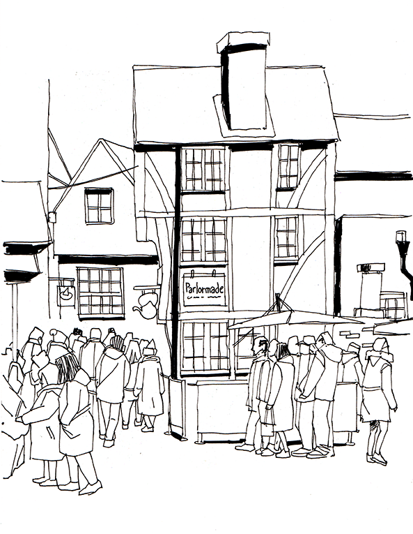
Here I managed to grab a sketch of the little shambles : that’s the small street straight to the left where the people are concentrated. this leads to the main Shambles street which is to the right and a square to the left. just about all the buildings around this area are leaning in some aspect and there are a few points down the shambles street where residents could open first floor windows and shake hands they are so close together. It’s one of the best preserved Medieval streets in the world.
The street gets it’s name from Flesh Shammels, or meat benches where the butchers would display meat in the past.
This area is heaving all year round with people and the day we were there was no exception.
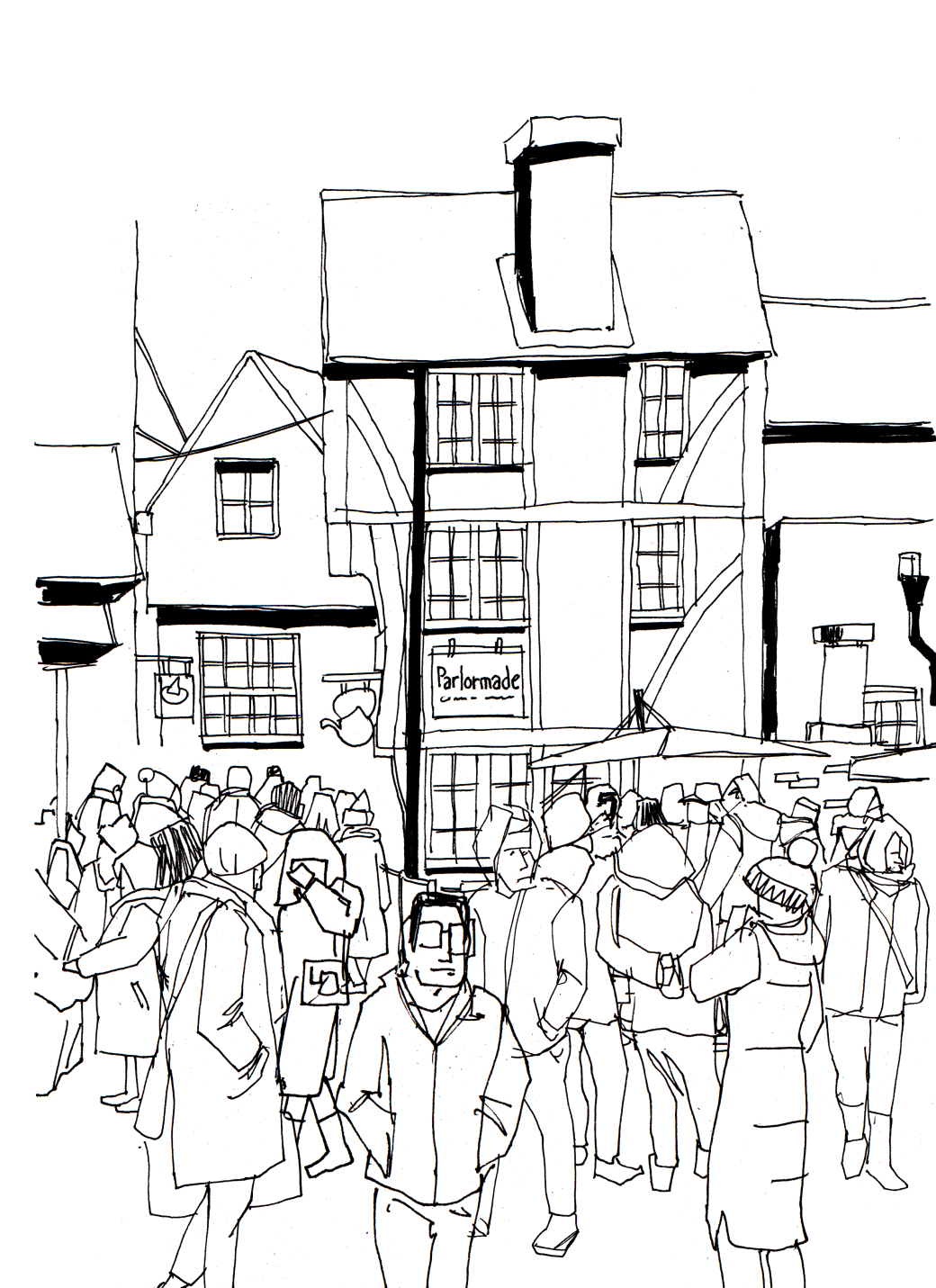
I liked this view in particular and thought it would make a good study to colour. Compared with the original though, I thought it could use some thickening out with shoppers to make the scene appear busier. This was where I felt I could use a few of the previous people studies.
As i wanted to complete this colour study using watercolour, I had to enlarge the sketch to A3 to transfer it to a heavier paper so I added in a few of the previous people sketches in photoshop, adjusted their scales appropriately and moved things around until I felt happy enough to scale this up and print it out.
I only have an A4 printer, so enlarging was a case of printing in two halves then taping these together, rubbing the back with pencil then tracing the image down onto stretched paper with a red ballpoint pen to see where I had traced.
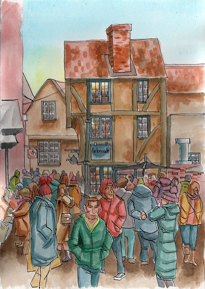
Once this was transferred, I took a dip pen and indian ink, then recreated the sketch, trying to keep as loose as possible. The painting was mostly wet in wet, working from a photograph from my phone for colour references for the building. I winged it with the people and just went with what felt OK when adding colour, keeping everything quite muted with contrast mixes.
Conclusion
I intended formalising this more with a layout and as with my Sketchbook module work, I would have liked more time to mock this up with a final finished look with some text : i’m out of time unfortunately here. Things that worked for me were the collection of figure studies I created. This might be considered a bit of a hack in some respects, but I believe what gets the job done and can be fed into a final result doesn’t hurt : it was a time saver for me here.
I feel i’m still trying to find my holy grail when it comes to a nice accessible colour medium to use when i’m out and about, I do like watercolours but i find them too fiddly to use outdoors as i’m moving around constantly. I like Posca pens, but feel limited with the colour range and sharpies (other than black for outlining and filling) are too lurid. I love the wash effects I found I could achieve with fountain pens and non waterproof ink though!
I’ve found so far that relying on photographs for colour reference after the fact is useful, but I would prefer to get some of the colour recorded live alongside the sketching stage.
This was a pleasant chance to be out and about and sketching again, even though i’ve been going through a particularly stressful period in life this has proven a great antidote some days.
