This was an interesting and thought provoking introduction to the variety of illustration types and their cross overs : there are so many things which use illustration these days the cross over is seemingly endless. Looking through different illustrators work, you can see developing trends and how they often inform and influence one another. A look on any art agency website will confirm this to a degree, the higher the percentage of represented illustrators, the more you can see some similarities.. as well as many unique styles.
I’ve always found a good place to start when looking at current illustration styles in one place is an art agency site.
I’ve never had any success when submitting work to agencies in the past, although to be honest I didn’t really persist in trying, mainly through never feeling my work was good enough to compete. Every once in a while I would work away in my spare time, trying to learn new things and improve, then submit a portfolio update : always with the same response.
I did submit some work to an agency years ago in London called Advocate and they invited me down for a chat, which was very positive.. but ultimately this didn’t lead to anything. Still, I always kept a regular eye on their website to see how trends were developing, what illustrators were doing, producing.
From their current website, I had a browse through the illustrators they represented and picked out a selection who I believe show a decent breadth of styles and genres..
Nick Scurfield
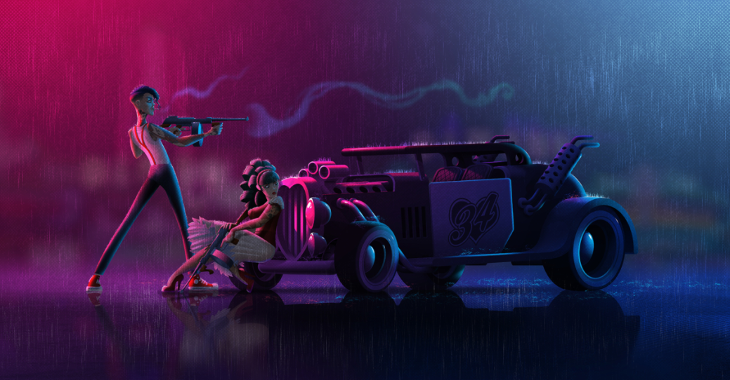
First, I thought I would start with an illustrator and good friend, Nick Scurfield. I’ve worked with Nick at two companies, and he’s a thoroughly decent chap with a great eye for design. He was Art Director on the last game project I worked on with him and he set the tone and style for environments and characters. He’s one of what I believe are very few artists to be authorized to produce licensed Star Wars art among other accolades. He has a great command of colour use and I admire his use of dramatic colour schemes and contrast.
________________________________________________________________________________________________________________
Jon Lycett-Smith
Another former colleague and friend, Jon is primarily a children’s book illustrator with a very impressive list of published books and collaborations, but can turn his hand to anything. We first worked together in a games studio, where he was a concept illustrator. His more serious work always reminded me of european comic art, it has an unusual and quirky style.
This is from a small press comic by Simon Perrins and Andrew Livesey called Hope for the Future, jon did a guest slot on this issue..

________________________________________________________________________________________________________________
Adam Doyle
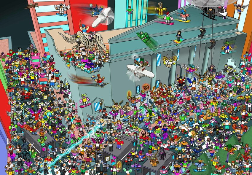
Adam Doyle specializes in large crowd scenes, a subject I mentioned previously when referring to Wimmelbilderbuch style artworks. I love the quirky style and technical ability in these images, they’re very rich and are superbly presented for inquisitive minds and eyes of all ages. They’re quite unusual and playful in their use of orthographic and two point perspective, one or two are isometric even, making them reminiscent of pixel art.
________________________________________________________________________________________________________________
Eugene Smith
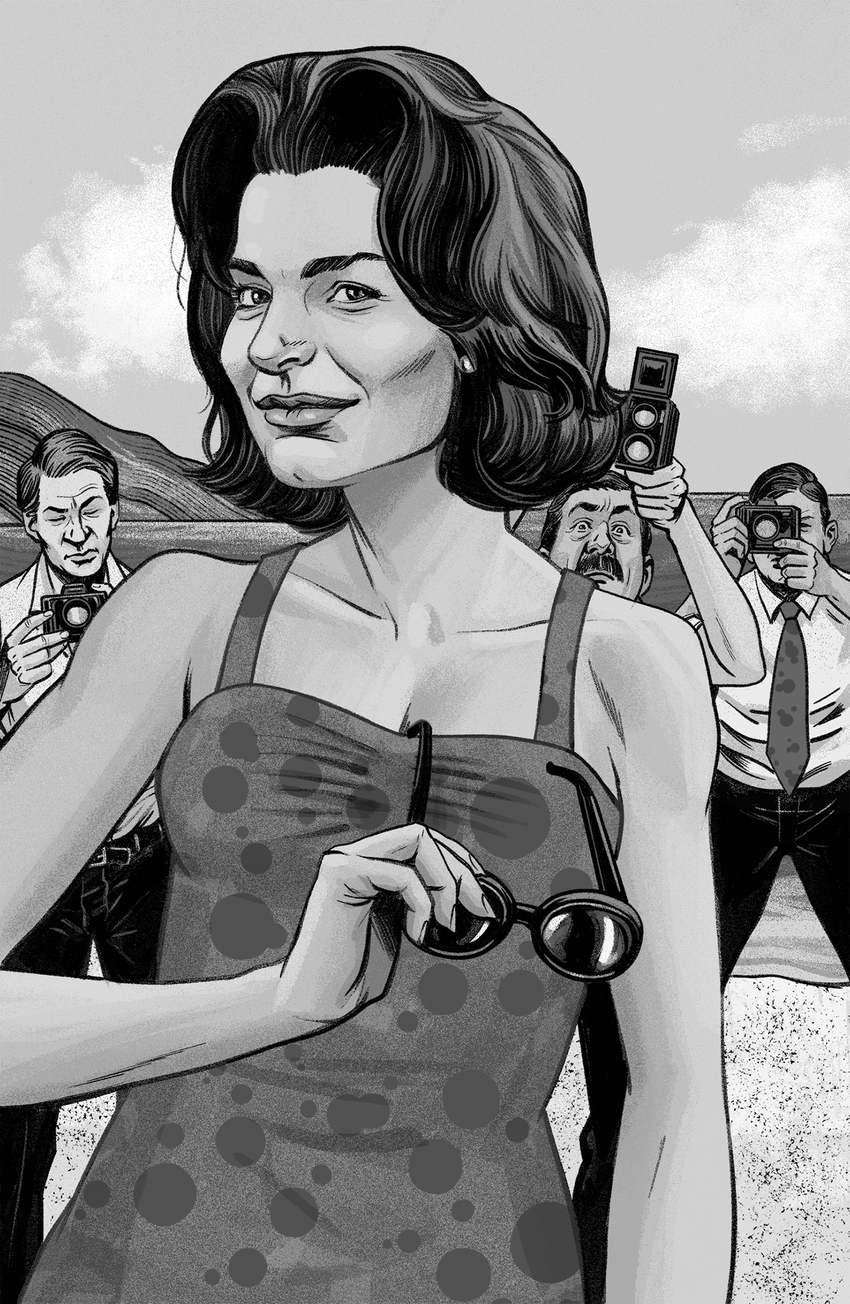
the work of Eugene Smith is eye candy at every level : it’s evocative, comedic and just beautiful to look at. His editorial work is superb, likenesses are captured perfectly in satirical situations and they’re executed flawlessly. His style is suited to a broad range of subjects and although not limited to them, figurative works are his real ouvre here.
________________________________________________________________________________________________________________
Peter Greenwood
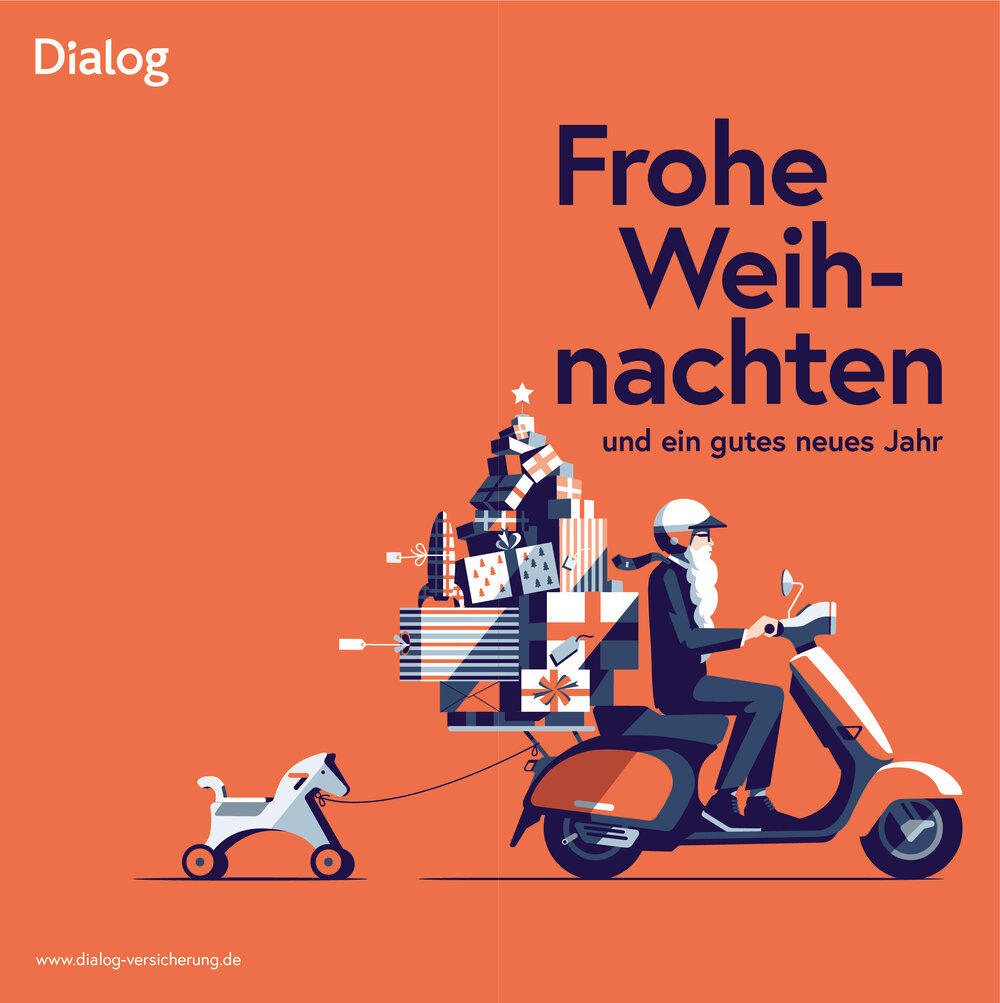
Brighton based illustrator Peter Greenwood has a very design driven aesthetic, with clever use of shadows and economic yet harmonious palettes. There’s a retro 60’s graphic design feel to his work in places, (look at that rocket gift in the image above : that’s almost atomic age 50’s!) yet with a contemporary twist. It’s a very clean and linear style, what i’d personally term a made for adobe illustrator style and that’s in no way derogatory. I’d pin this as a perfect advertising and editorial style, very clean and crisp and able to telegraph ideas well.
A selection of images are augmented with cyclic animation to add a further dimension, something which has been fashionable for a while in digital illustration.
________________________________________________________________________________________________________________
Emanuel Wiemans
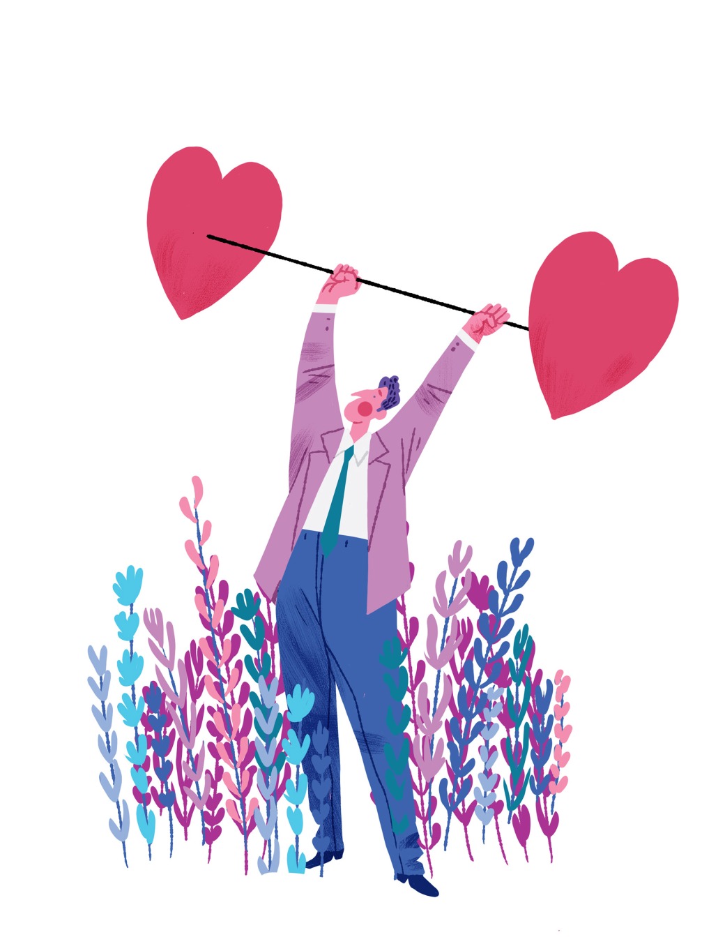
Now here’s an illustrator with a full on retro feel. Based in holland, Emanuel Wiemans creates illustration for all manner of diverse fields, from editorial to books, character designs to storyboards. His work has a lovely classic feel to it, some of which reminds me of the public information films I remember on TV as a child. The colour palettes are accurate for the vintage look too, lots of pastel hues and duotone / spot colours. Interestingly, rather than settle on one fixed style, the artist runs a gamut of retro styles which are all under the same hood. the black and white art for instance has it’s own distinct look when compared to the colour work. I find this quite unusual and in a way it’s clever : this level of versatility probably allows the artist to capitalize on work opportunities without letting go of the look he’s known for.
________________________________________________________________________________________________________________
Nick Hayes
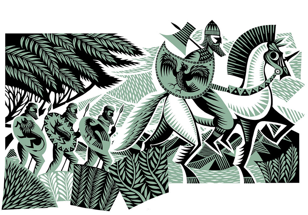
Illustrator Nick Hayes creates illustrations in the style of linocut prints : as well as actually producing linocut prints. There’s very little deviation in styles, the main difference being that of nuance where the prints are concerned, the more unique hand authored look you tend to achieve with relief printing is absent in some of the cleaner illustrations. Nevertheless, the surface patterns used in both are powerful and striking and it’s little surprise that the artist has created book covers. Interestingly, in contrast to the print / linocut style, the artists cartoons have a quite different feel to them
image references:
https://nscurfield.com/illustration/
https://www.adamdoyleillustration.com/
https://emanuelwiemans.com/editorial-illustration-1
https://www.peter-greenwood.com/
