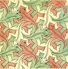
M.C. Escher
I doubt any mention of illustrators who work with interesting surface pattern design can be discussed without mentioning one of the better know artists, M.C.Escher. Technically brilliant in it’s design and execution, Escher’s work is in a class of it’s own as it fuses impossible imaginary scenarios and architectures with classical perspective theories and patterns design. This particular type of repetitive symmetry and tessellation before the advent of computers cannot be overstated enough in it’s execution. These days, vector based image creation software such as adobe illustrator can take a single image and allow the user to manipulate it into a huge variety of repeating surface designs in a small amount of time. It’s incredible to think that Escher created these in a very considered way and often relied on studies of artifacts from various cultures in antiquity along with mathematical theories regarding repeating polygonal patterns.
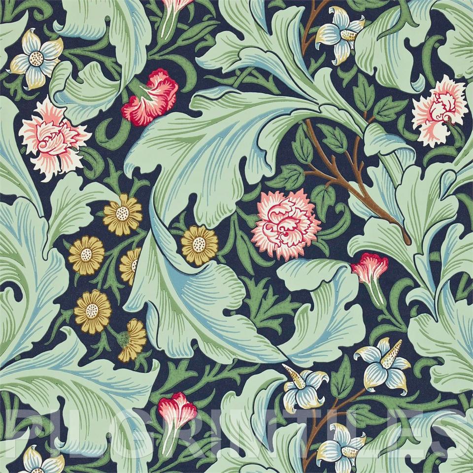
William Morris
William Morris was a multi disciplined artist and eventually a much sought after textile and interior furnishings designer of the Victorian period, establishing his own partnership company which he would ultimately own outright. Even today these are exceptionally recognizable designs and they are still extremely popular for a timeless and vintage look. Many of his wallpaper / textile designs feature flora presented in an art nouveau style, reminiscent of medieval illuminations in places with it’s lustrious embellishment. Visually it’s quite busy and ostentatious, yet the colour choices are very considered to counter this and they work very harmoniously. The use of black or near black as a base is a great neutral canvas to set off the foreground colours.
Savannah Hayes
Savannah Hayes is an artist whose work has a graphic inspired feel to it, often with a dazzling clarity and simplicity using limited pastel or monochrome colour palettes, augmented with metallics. Some of her wallpaper designs have a natural world appearance which remind me of animal skin textures, earth and sand textures, others are reminiscent of urban structures or patterns, even graffiti. I particularly like the naming conventions she uses for her design ranges, giving names of countries or regions where you can match the cultural vibe to the design aesthetic.
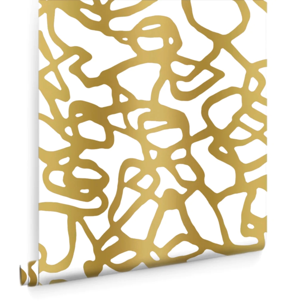
Pompeii type II Wallpaper – Gold
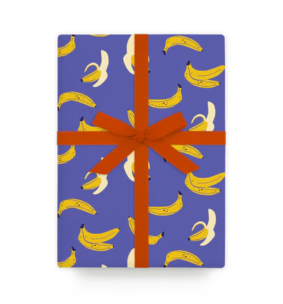
Lagom Design
Lagom Design are a print and design house specializing in greetings cards, gift wrap, gift bags, postcards and notebooks. They have a range of designers on their books producing all sorts of different styles with a higher end boutique feel.
Here’s a few which caught my eye while looking through their range :
Naomi Wilkinson
This Designer has a very bold and decorative style featuring very pleasing colour palettes which have a retro feel to them in places and this is more evident in her postcards designs based on capital cities.
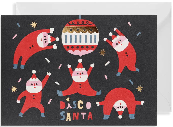
Hsinping Pan
Here, the designer uses a flat and bold decorative style to create whimsical greetings cards with striking colours and metallics. I like how the character shapes would work in silhouette here regardless of the simplistic style choice, which is a key to good character design.
Molly Egan
Molly Egan’s designs are quirky and bold, using simplistic shapes and pastel colours with a folk art edge. Her wrapping paper designs rely on repeated self contained illustrations rather than surface pattern and are effective and eye-catching regardless.
Yago Partal
Something slightly different here from Spanish designer / photographer Yago Partal, this lighthearted wrapping paper design features repeating patterns of anthropomorphic creatures ; for all it’s visual detail this design works really well due to it’s carefully considered palette combinations.
Thoughts..
This research point was an interesting exploration of how flatness comes into play with a large aspect of these varieties of surface design. It’s interesting to note how literally any repeated design these days can be reproduced onto pretty much any surface imaginable.
The very last year I worked in screen printing was 1998 and our company packed the print workshop staff off down to the print world expo down at the Birmingham NEC for a few days to see what new developments were occurring.
The first commercial Epson wide format printer I saw there was churning out a digital facsimile of the sistine chapel ceiling all day long.. and it was printing it on hessian on both sides simultaneously.
Just when I thought things couldn’t get any worse for us manual printing artisans, a crowd were stood watching a rep from one of the big machine manufacturers demonstrate a four colour non impact print of a windsurfer onto an egg yolk. This was just getting ridiculous now..
As a side note, I did also work at a flag and banner company for a few years and the flags were printed using an old manual process which was used to create Victorian wallpaper before machinery existed. Where the wallpaper was produced using blocks, we used silk screen printing instead on a huge long rubber backed table, lifting and registering the screen to create repeated patterns.
Anyway, a bit of a digression : the point is how far graphic reproduction has come in such a small space of time.
Back to the examples, it’s interesting to see how the Victorian / nouveau era designs were still mostly using representational style designs which featured richly illustrated floral design with depth and tightly repeated patterns which wove into one seamless image. As more abstract design came into existence, these relied less on pictorial observation and shape and colour were in vogue, rendering surface designs much simpler and less fussy.
There’s an element of very creative thinking behind any design which features repeating patterns : human brains are developed to instantly recognise repeating patterns and are especially attuned to those of a visual nature. If it’s the intention of the design to embrace this, that’s great. The tendency with repeated patterns though is to generally make the tiling as inconspicuous as possible and that’s where the clever design happens.
As I mentioned earlier, the advent of computer programs makes the process of tiling images much simpler than it probably was in William Morris’s day. Escher on the other hand…
________________________________________________________________________________________________________________
Image references:
https://en.wikipedia.org/wiki/Reptiles_(M._C._Escher)
https://morrisandco.sandersondesigngroup.com/search/wallpaper/?q=wallpaper&Page=2
https://savannahhayes.com/collections/type-ii-wallpaper/products/pompeii-type-ii-wallpaper-gold
https://www.lagomdesign.co.uk/products/banana-naomi-wilkinson
https://www.lagomdesign.co.uk/products/disco-santa-hsinping-pan
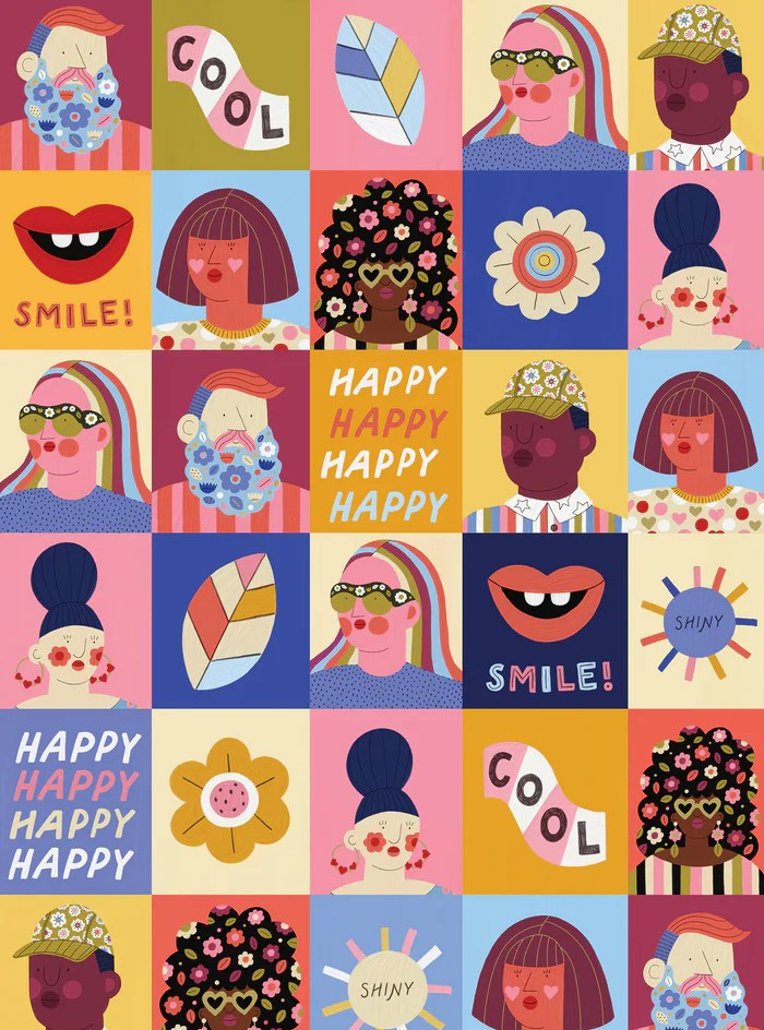
https://www.lagomdesign.co.uk/products/happy-portraits
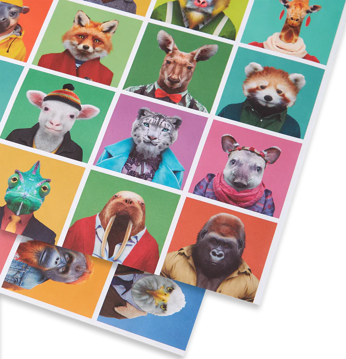
https://www.lagomdesign.co.uk/products/zoo-portraits-wrap
