This research point looks at the relationship between type and image. I’ll start this by saying I know little about graphic design : I often wish i’d taken it as an elective module on level one, as even a basic understanding would be helpful. I’ve opted for a few Udemy courses to cover the basics regarding layout, text and fonts, colour relationships and meanings etc. which will hopefully put me in a better place when it comes to making decisions regarding type at least.
When applying type to support an illustration, i generally stick to a two is enough rule instead of cluttering with lots of confusing fonts, although i’m pretty sure as with all rules there are going to be times when this could be broken (thinking of zines particularly here, especially punk or underground themed varieties). There have definitely been times when I wish I could have augmented an illustration with some appropriately custom type, either hand drawn or otherwise, but unfortunately as I don`t particularly know what rules govern font and type choices really, i’ve more often than not felt my way through creating anything intuitively which perhaps isn’t going to be the best approach.
Back to the research point, here are some examples which i’ve chosen.
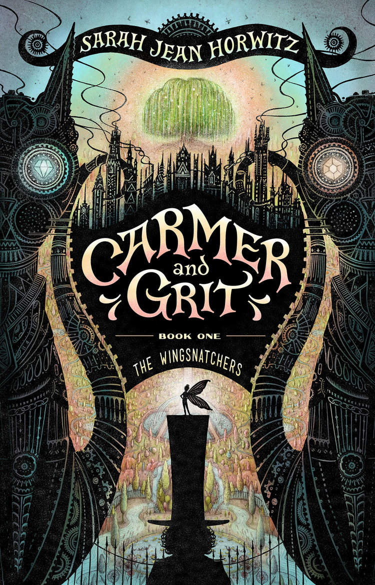
This is a fine book cover by Jaime Zollars. This design has been considered from the outset with space for the title, author and volume text, the main font used for the author and title fits the feel of the supporting illustration really well : even without knowing what the book is about, the title is appealing immediately and it evokes a fantastical feel. The decision to cut out to the background beneath gives the whole cover a sort of Victorian magic lantern feel through the foreground being in silhouette.
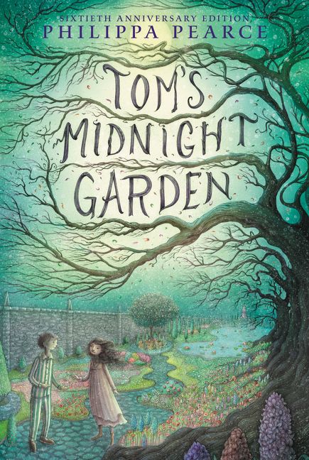
Here’s another example by Jaime Zollars, a popular book! This is an example of what appears to be an integrated typeface : created to compliment the final cover, but not necessarily applied as part of the illustration. It’s a great match however, I suspect it has probably been created separately by either the artist or a graphic designer and tweaked digitally to match the surrounding colours. I wonder what happens if the book is translated into German? (Tom’s Mitternachtsgarten) : maybe the title is universal.. I love how the type appears to be part of the illustration though, it’s a very sympathetic match and works perfectly, the diffused moonlight behind provides the perfect vignette for the text to stand out. The author text uses a serif font to convey a feeling of trust and solidity, in the context of this cover it likely says the book is an evergreen favourite for children.


I couldn’t get enough of these pulpy American horror comics when I was growing up, I’ve collected a few of the rarer examples of these Warren Publishing magazines. They featured instantly recognizable brand titles such as Creepy, Eerie, 1984 and Vampirella. Each magazine had incredibly tight turnarounds and deadlines for artists and the stories and art were of an incredibly high standard. Sometimes the covers were great…other times, not so much. The covers in particular always felt somewhat chaotic with regard to the layout and often you could see that the logo text would be clumsily blocking out a key part of the illustration. The Creepy cover here on the left feels like it could have either been a conscious decision to make the antagonist’s head pop dynamically or simply a compromise rather than making a clumsy tangent / fused edge with the other character’s foot with the bottom of the page. The Eerie cover in the centre has a block of text in the upper right side which looks decidedly crow-barred in and it creates a nasty tangent with the building in the background. The 1984 cover is just terrible : the main character’s hat is protruding so far into the title it reads as 1934. Both the Creepy and Eerie magazines used a similar body text for paragraphs which rarely seemed consisted and would change clumsily across each issue. The later 1984 magazine at least unified this with a more modern looking sans serif font which had a more sympathetic feel to the Sci-fi nature of the publication. I get the impression much of the design layout process could have resulted that way through miscommunication perhaps between the art director / layout and design department and the cover illustrator. Given the tight deadlines it was probably easy to see why this could happen. Still, in a way it contributes to the overall lurid and pulpy appeal and these are vintage magazines now after all and a great part of how these kinds of magazines look and feel has become a pop culture iconic trope which many illustrators seek to impart in their work.


The series of unfortunate events books by Lemony Snicket have a lovely consistent design, which adds to their collectibility appeal. The colour coded spines mean each tale can be instantly selected on sight without the need to read the title, always a nice touch in a series : plus they look great on a busy bookshelf. There’s a spiky shape language to the consistent background image (which looks like a silhouetted mansion orangery) which sets the theme up well, and this is continued onto the spine, it’s a very slick design and it reflects the anachronistic feel. The spine colour is cleverly coloured to match the overall tone of the illustration too, (or vice versa) this isn’t an accident. Each title illustration is designed to fit within the predetermined layout which gives a nice solid consistency, with some of the illustrations bursting out of frame to add dynamism. The main series font is a clever nod to Lemony Snicket’s battered typewriter which features within the stories and is made reference to, the worn and slightly chaotic look gives the books a feel of ominous foreboding. The use of a script or brush type font adds a touch of light hearted elegance which counters the more serious looking title and let’s the reader know it’s light hearted too.
Conclusion
From what I observed during the course of this research point into typography and it’s relationship with illustration, I would conclude that this kind of consideration between type and image is more of an important aspect to visual communication than ever, particularly with books being such a saturated market place. The competition for book covers to grab an audience’s attention has never been more fierce and there are many trains of thought when it comes to the end product. There still seems to be a split between stock photography montages and bespoke illustration, with the former being almost exclusively confined to fiction novels aimed at the adult readership. Contrasted with younger and teen audience material which is almost exclusively illustrated and there exists a hugely demanding market for graphic design and illustration skill sets. I found it deeply interesting to see how good design principles compliment illustration and just looking at how fonts work together on a cover for example has given me a fresh view on how considered these aspects really are.
Image references:
https://www.svslearn.com/news/2018/3/19/book-cover-art
https://www.coverbrowser.com/covers/creepy/2
https://www.slabcitycomics.com/products/1984-no-5
