In this exercise, the aim was to produce a series of illustrations that explore my own relationship to digital technologies.
Introduction
I’ve a long affinity with digital which started way back in 1983 with the first home computing boom, my first colour console being the good old Atari 2600, progressing onto a Commodore 64, a machine I dearly loved for it’s slick (for the time!) graphic capabilities and amazing sound chip. The only machine which really topped this was the Amiga 500, a 16 bit computer custom made for games.
8 bit, Sprites and the evolution
I think I pretty much covered the computer side of things already in the research point, so I’ll try keep this to a less wordy sojourn into the evolution of graphics. The Atari 2600 was a hugely successful (now vintage) cartridge based system with an extremely limited memory and graphics capability, very rudimentary and primitive by todays standards. I only mention this here as it was my first video game system personally, and along with arcade machines of the time, this was the first console which fired my interest and set up my journey with digital graphics.
Although the 2600 was a great early system, you couldn’t do anything beyond playing games which came on cartridges (there was a peculiar membrane keyboard available which was non-standard and allowed for programming for the technical minded). My first serious computer was a C64 and this was the machine which allowed me to mess with graphics. This wasn’t the simplest machine to get to grips with compared to the other home computers on offer, and to get the most from the graphics you had to get your hands dirty and program some things..
![]()
This Excel sheet from Paul’s Notebook blog calculates the binary values for a sprite on a C64. If this sounds like black magic, it’s not : it’s tedious. Imagine Pac man, this would be one of the moving elements on the screen, such as the pac man or ghosts. To create one back in the day, you would have drawn this first on graph paper, then entered all the values here on the righthand columns into a string of data on the computer. Unless you were good at assembler programming, in which case you would make your own tools to draw these things and that’s how graphics programs evolved. There’s a working example with the code here if the inclination for a deep-dive hits anyone.
So as computing power has increased, we’ve moved on from these very limited grids of pixel dimension and limited colour to true colour displays which are in the millions and 4, 8 and 16K resolutions.
Pixel art however has never lost it’s appeal and is embraced more than ever as a quite nerdy and retro look, the reserve of nostalgic purists and graphic design geeks everywhere. In the games industry it’s adored by all to varying degrees, especially 2D UI (user interface) artists.
I’ve never lost my own personal fondness for it, and I can’t really explain what it is I even like about it, I do know It’s related to the vintage throwback to my early teens and that first taste of graphics and programming.
![]()
This is a close up at grid level from photoshop of a piece of pixel art which I created one lunch time at work while I was looking for something to occupy myself rather than reading the doom-laden news.
Photoshop is a hideous program for creating pixel art in, the tools aren’t in the least geared up in any way for it, and beyond the pencil tool there’s precious little to manage palettes efficiently and easily. Something like Cosmigo’s Pro Motion NG is a much better proposition for creating pixel art, pixel animations and tile sets for retro games, plus it’s dirt cheap in comparison. Having said that, everything I present here was created using Photoshop, just because we have very limited access to other software at work.
These are pixel art portraits which I make up during lunch hours, usually if the weather is to bad too get outside..
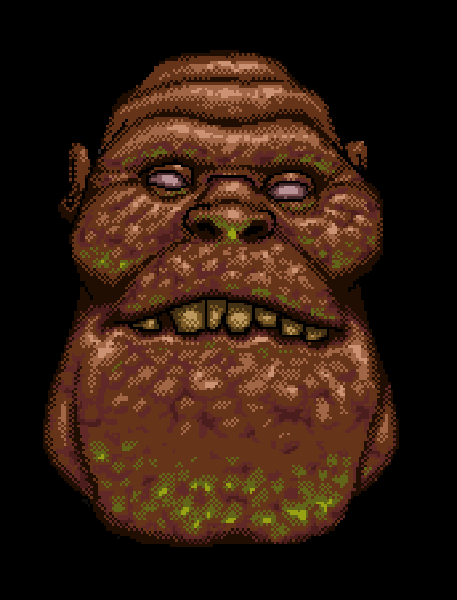
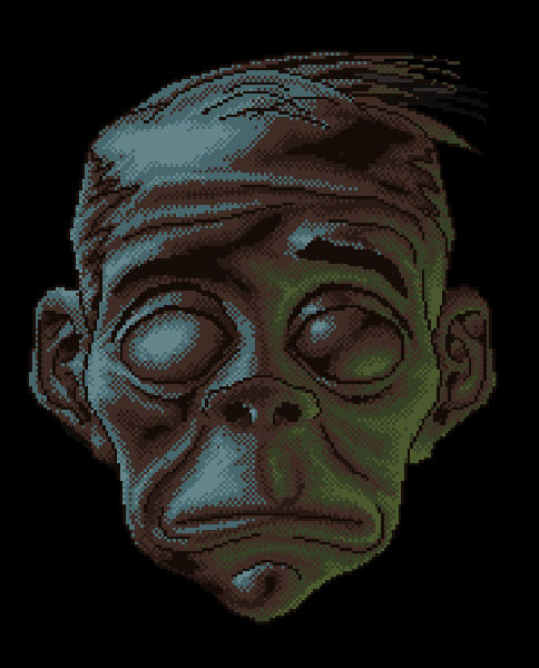
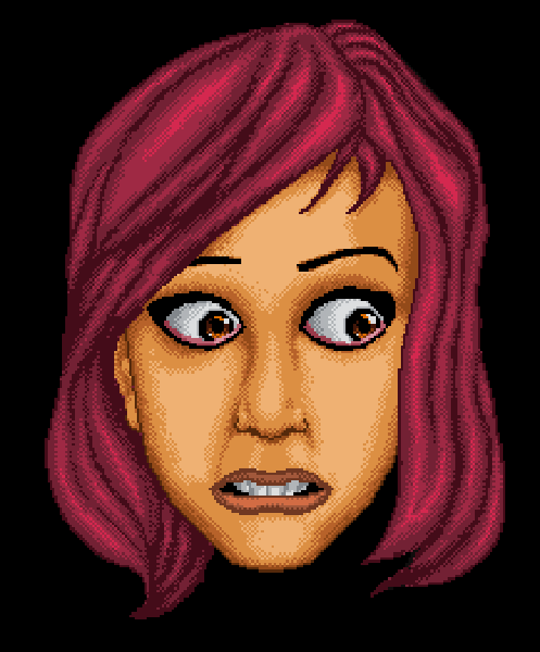

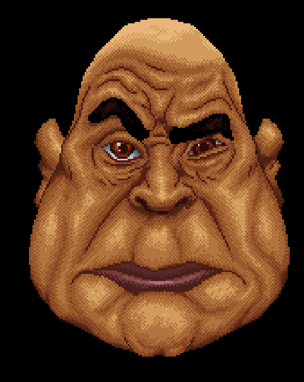
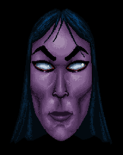
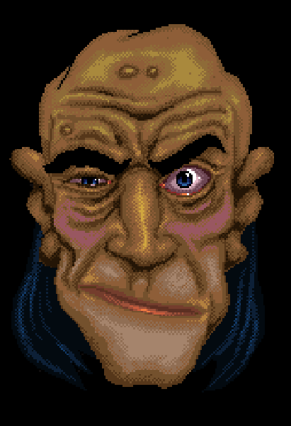
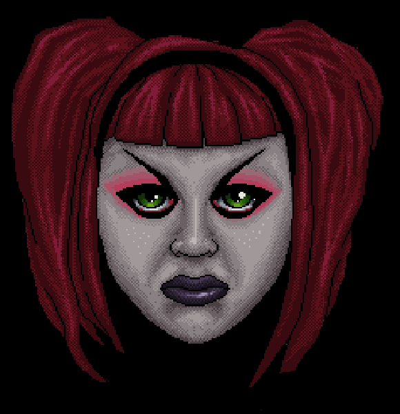
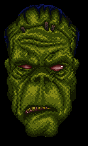
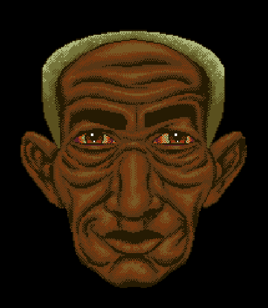
These are all using limited palettes, so usually a few shades each for skin, hair, etc. Here, these are scaled up in photoshop using nearest neighbour so there’s no anti-aliasing smoothing applied, as this would ruin the clean pixel look by adding in smoothing colours all over the place.
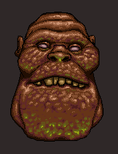
For comparison, this is the actual size of the first image at the top..
Using limited palettes on early computer systems led to dithering, which is the process of laying down a chequer pattern of each colour next to each other to create an optical transition. When viewed at the actual resolution on screen, this can be pretty convincing in fooling your eye into thinking there are more colours than there really are.
I generally create these so quick I don’t bother to consider the contrast much so they often turn out rather flat like mugshots, which I’m not too concerned about really as they’re literally fun pieces.
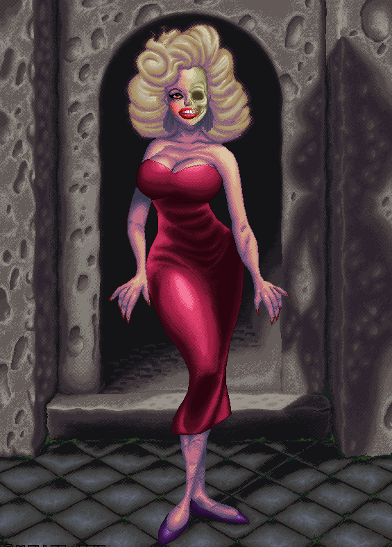
This is a much larger image done in Photoshop, The ghost of Jane Mansfield. Disregarding the very dubious hand anatomy, this started life as a sketch, then a pixel outline, colours then shading.
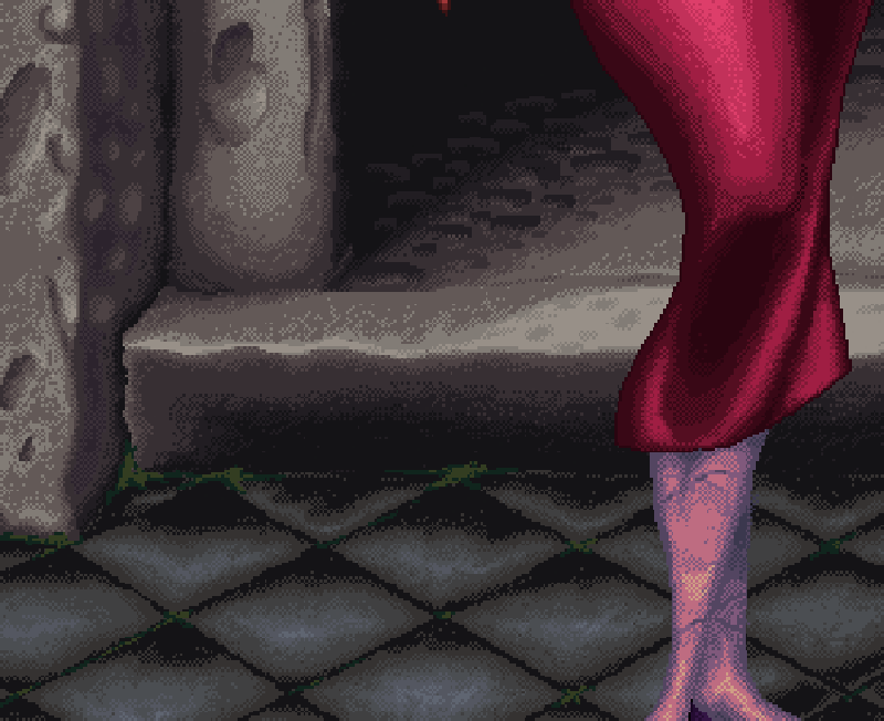
This enlarged detail shows the pixel shading..
 It might not impress the average person to know that unlike most other sane pixel artists, I hand place each dot in the image, drawing these in while looking at a real life sized (much smaller!) real time image as I go, so it takes a while : masochistic I know, but it’s a sure fire way to get into the zone in no time flat 🙂
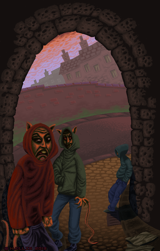
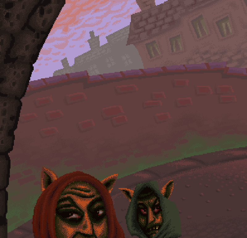
This is a pixel image from a long while ago, (2013?!) on the theme of Sewer Rats. I went for some aerial perspective in this, with muted colours at the back.
These characters had quite menacing faces, they really represented the increasing armies of ne’er do wells which had been accumulating on the local street corners at the time, this is a pretty evergreen social issue which can be a good source of material for commentary through art, poetry etc.
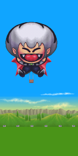
On a final subject of game art, this is an unused piece I created for a very well know game a long time ago, which was released on the Nintendo 3DS. I was very lucky to have free reign on all the background art and the retro look was well received by the publisher as it gave a nod to the original game which this was based on.
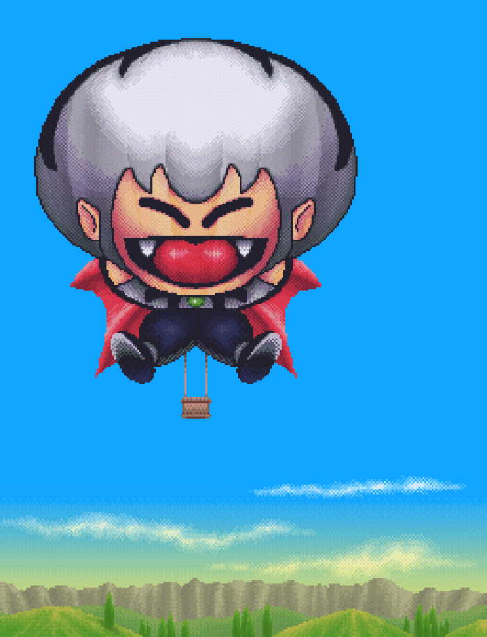
This is a more detailed close up with the pixel dithering in evidence. Each screen was taller than wider as it was scrolled vertically into place before the game started. This gave an overview to the player of what was either above or below their starting point. Here, there were a series of hot air balloons featuring either a character or some form of advertising.
Conclusion
This was a nice chance to revisit something which I still enjoy doing all these years later. I wouldn’t say it’s a lost art by any means, as I mentioned previously the resurgence in recent decades of retro gaming and graphics has re-ignited the whole pixel art style, It’s a bit of a painstaking way to flex my dot by dot muscles even if I do have to zoom the screen in further these days than I used to. Using limited palettes is a bit like real life painting, you have to be a little more creative in how you decide what to use where and when, without the luxury of even being able to mix them as you have a set number of colours and nothing in between (unless you choose a larger palette of colours that is).
While I was enlarging these images, it crossed my mind that something on a theme with these faces might make a good sticker set.. certainly one to try-out on the back burner!
Image references:
