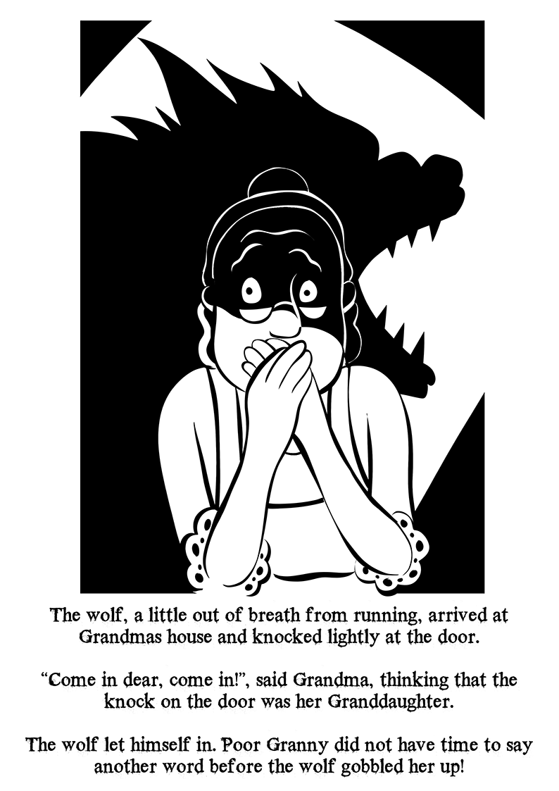
In this research point, the aim is to compare the relationship between narrative and style of drawing being used in either a comic book, cartoon or graphic novel.
I love comics and graphic novels, i’m by no means a nerd though and i’m pretty particular about what I read. I appreciate many older comic artists and genres which are less accessible these days, mostly horror and underground type comics. I’ve collected a few sought after editions of comics, but nothing mainstream such as marvel superheroes or DC.
There’re so many titles and genres on offer that I rarely have the time on a weekend to go browsing through them all at the local Travelling man or OK comics in Leeds, so I often buy graphic novels that I didn’t get around to reading the first time round when they were published : or i spin the wheel of fortune and ask one of the staff for recommendations (and i’ve had some absolute gems).
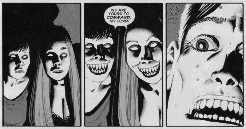
I often have a browse through the indie rack where the self published small press comics are, there are some amazing quality offerings and i’ve picked up some really great examples of the genre. One of the more professional offerings I started looking out for was Hocus Pocus. This is a great format and it appeals to one of my interests which is the supernatural and the investigation and scepticism of it as a subject.
Hocus Pocus
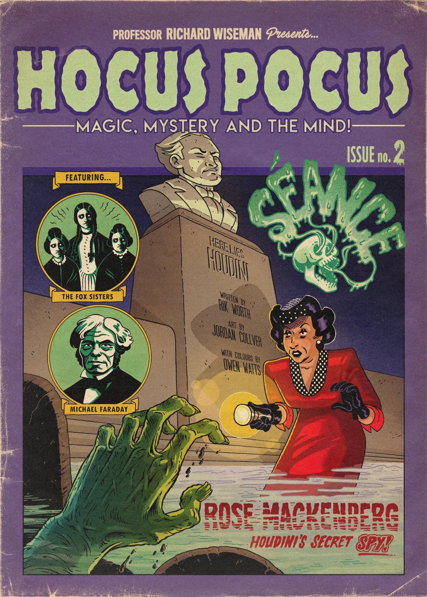
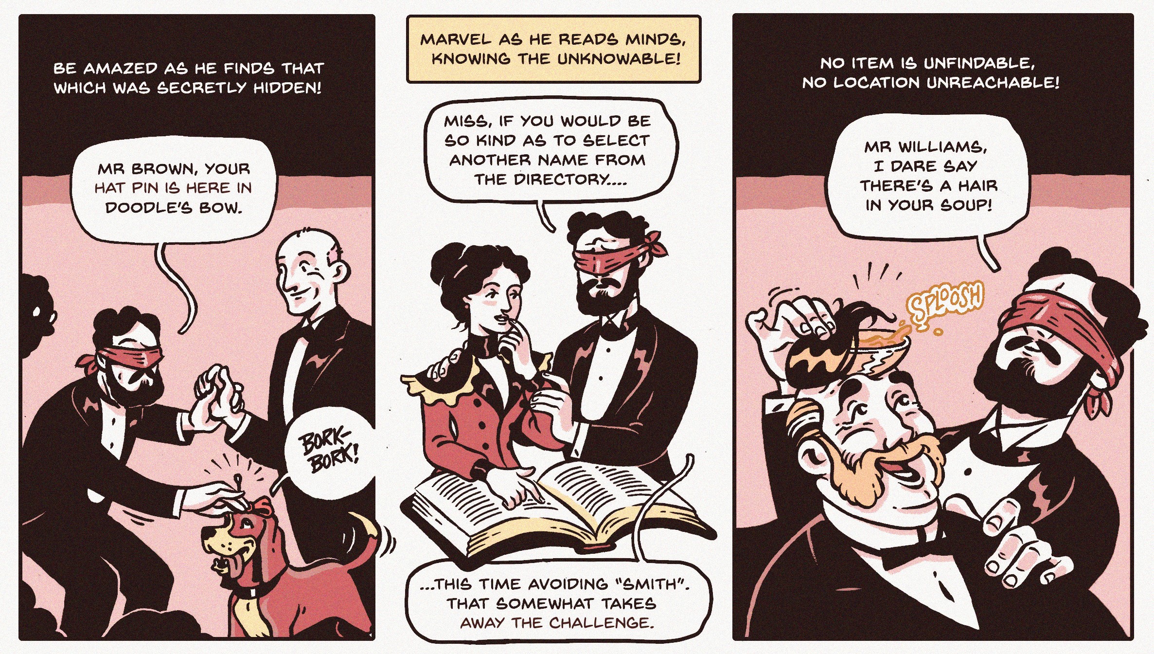
Aside from the clean and beautifully monochrome scheme artwork, the narrative is light hearted and comedic and reads very cleanly without being overly cluttered or wordy. In my opinion the art compliments the narrative superbly, visualising and setting the scene perfectly for each tale. Each issue focuses specifically on one particular branch of the supernatural, so mind reading, Seances, ghosts, levitation and prophecy and each contains particularly notorious examples of exponents related to each area.
Interestingly the series features Psychologist, author and magic circle member Professor Richard Wiseman as the creative consultant. It’s such a good series in fact that it was nominated for an Eisner award for best limited series 2022.
_________________________________________________________________________________________________________________________________________________
Black Hole
Comic artist Charles Burns’ dark tale of teenage angst and sexually transmitted disease against a 1970’s suburban American backdrop has become a graphic novel which has earned it’s place as a favourite among many other comic artists and writers, as well as garnering status as a pop culture icon.
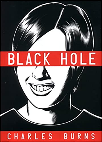


Burns’ artwork is reminiscent of wood or linocut in it’s quality, yet the style is more akin to lowbrow art of the 1970’s underground period, although the heavy blacks and deep shadows leave you in doubt that there’s something dark happening in the subject matter. Although the artist has created many colour works too, it’s undoubtedly this book which shows off his technical ability most. The story is disturbing enough to begin with, but combined with the dreamlike and often graphically hideous portrayal of each teenagers transformation, the experience of reading this is so compelling it’s difficult to put down once you begin reading.
The heavy use of contre jour serves to heighten and create constant tension in passages where something eerie is unfolding, yet there’s an economy of shading in other parts which pumps the emotional response while reading : it’s subtle but very effective.
The narrative is paced brilliantly and there are visual metaphors and entendres throughout, to say either the art or writing outweighs the other would be impossible here, they complement one another perfectly. There are word heavy places throughout, but the page designs and layouts are so technically considered that there’s no interruption in the pacing, which has to be a testament to just how well executed it really is. The book was due to be adapted into a movie with David Fincher’s involvement, but this fell through although it’s rumoured to have been picked back up by Brad Pitt’s own production company. It feels every inch like it ought to be a David Lynch production.
_________________________________________________________________________________________________________________________________________________
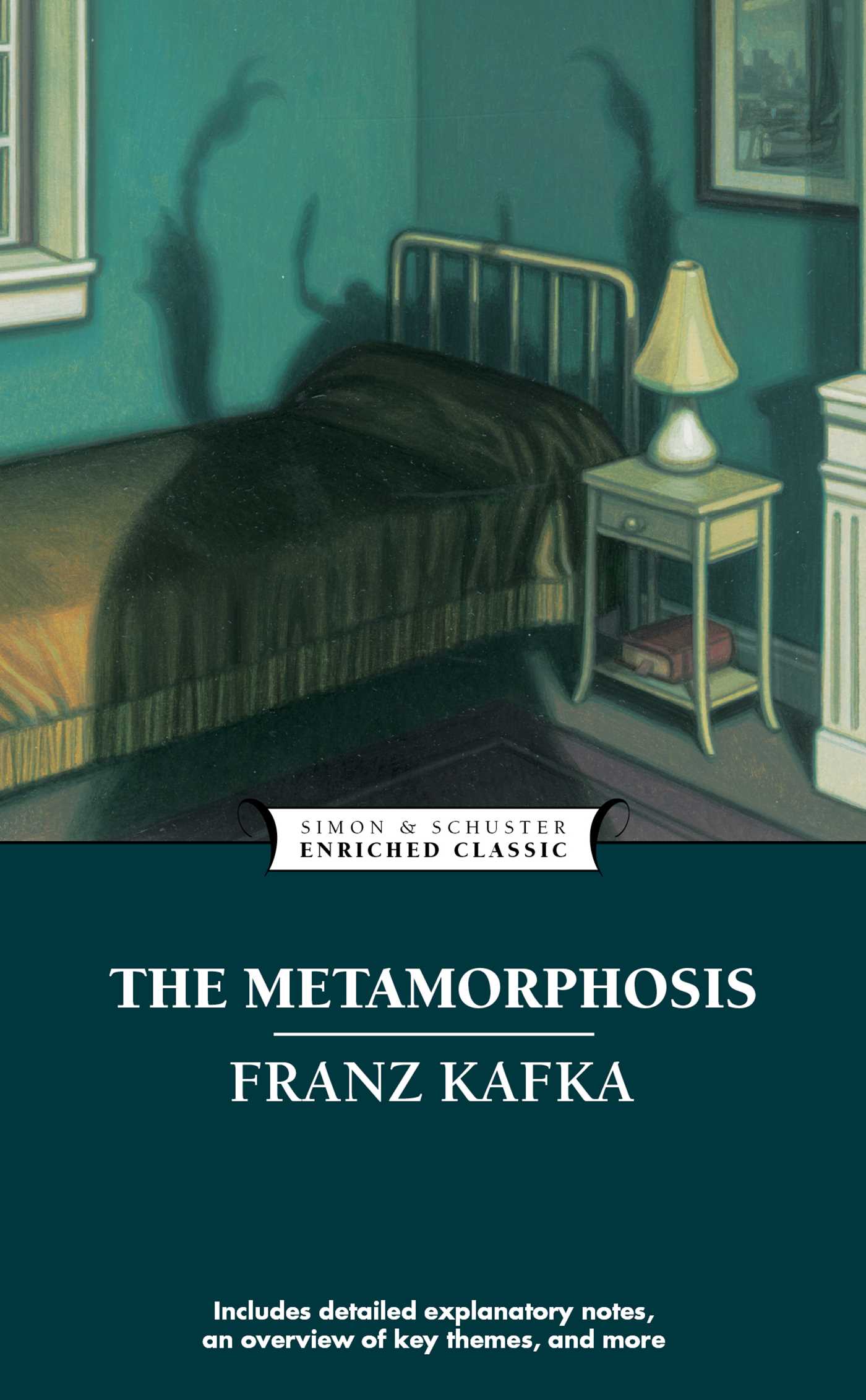
V for Vendetta
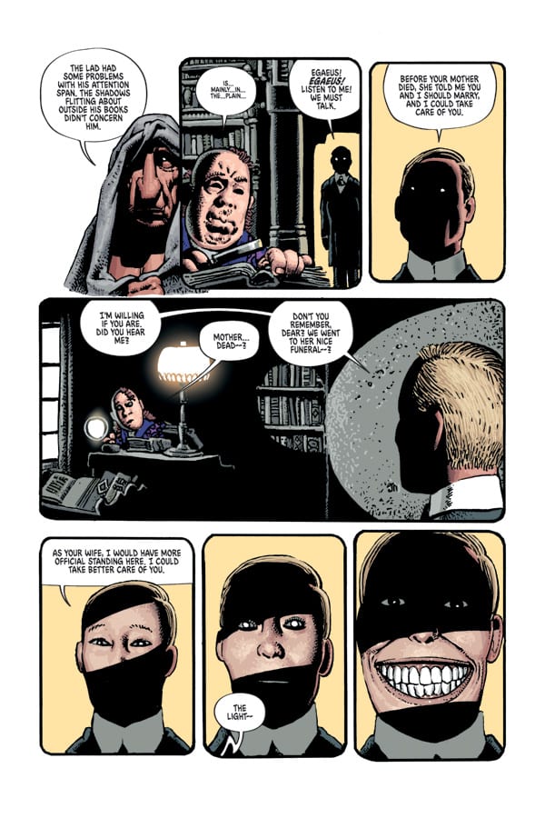
Alan Moore’s dystopian fascist nightmare is a superbly written graphic novel, first serialized in Warrior magazine in the early to mid 1980’s and superbly Illustrated by David Lloyd. The first comic strip I remember seeing David Lloyd’s work featured in was Night Raven, a Marvel comic strip in a hard boiled noir 1930’s. With that strip, I was more taken with the protagonist of the title wearing a mask which made him appear very mysterious.
V for Vendetta takes the mask wearing lead character to another level, cleverly fusing Guy Fawkes imagery into an antihero anarchist terrorist creating mischief for the established fascist government in the near future. David Lloyd’s design of the character V has seen the mask adopted by hacktivist groups such as Anonymous and other groups wanting to be seen as opposed to establishment in some way.
The first striking thing to notice about V for Vendetta as a graphic novel is that there’s a lack of sound effects as seen in many other comics : and V doesn’t have thought balloons, all his dialogue is spoken. This lends a cinematic quality to the reading experience where many panels of action unfold in silence and are left uncluttered completely without any text in many places. The result is, as you read these passages you get a real feel for the deadly stealth of V as a character. It was disappointing that many of these signature panels where V is seen jumping silently across rooftops on his way to assassinate some governemt stooge weren’t followed through in the movie version (Alan Moore reportedly hated the movie adaptation so much he distanced himself completely from it, I didn’t find it terrible…it just lacked lots of the brilliant sinister imagery which Lloyd created as stand alone panels : there was literally one shot where V was seen jumping over a roof in slow motion).
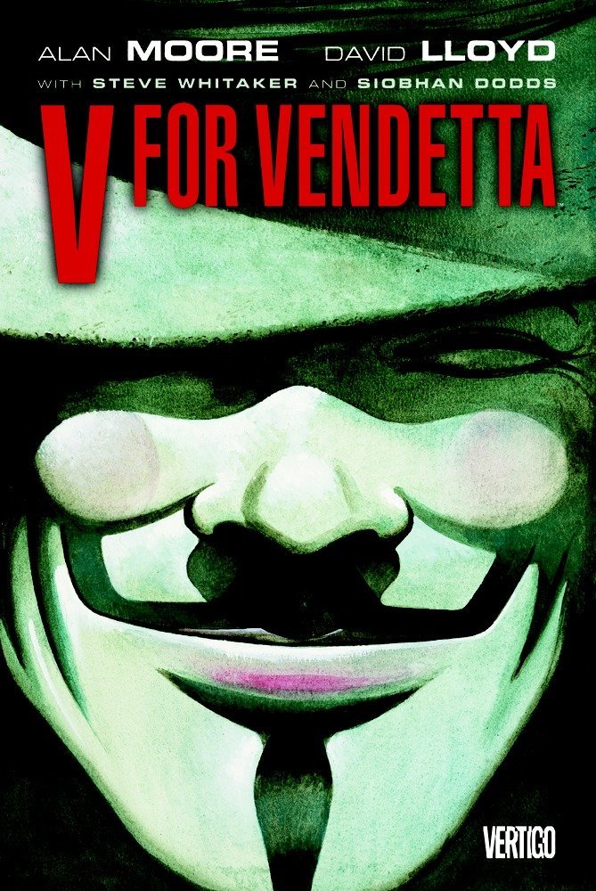


David Lloyd’s drawing style is so well matched here to this particular narrative, his heavy chiaroscuro adds superbly to the theatrical feel of the Fawkes character and reinforces the sinister dystopian world the novel is set in. Each face is rendered expressively and imparts ethos and pathos equally well where it’s needed in accompanying text. The original strip first published in Warrior was in black and white and this worked better visually without colour (which was added when the complete series was compiled into a complete graphic novel) in certain places, however the colour also worked better for certain panels. At least it was sympathetically coloured and for this strip i can imagine it was a challenging job given that it was a very high contrast work.
_________________________________________________________________________________________________________________________________________________
Richard Corben
I’m incredibly biased here as i’ve been a huge fan of Richard Corben’s work for the longest time and I couldn’t do a mention of anything graphic novel / comic related without including this ever popular and long time creator. Sadly Corben passed away last year aged 80 and he was still working on a semi retired basis right up until his death. Winning several high profile awards across his long career, Corben started out as an animator in Kansas City and made his own animated and live action movies, Heavy metal : the movie being perhaps the most high profile animation. During his early career self publishing underground comix, he developed his own method of creating vivid four colour separations which reproduced lurid and saturated colours, each plate being created painstakingly by hand and often using an airbrush to create stunning gradients of colour.
Corben’s oeuvre consisted of many genres of work, but he was primarily known for his adult fantasy and horror work in black and white, and colourized grisaille (unusually some of his strips were rendered partially in oil paints, resulting in beautifully sculpted and soft forms.
Corben wrote a great many of his own stories which were featured in other comics and they usually conformed to the eight page format so they could fit in alongside other strips. He also collaborated with other well known writers such as Jan Strnad and Bruce Jones, along with many others during his tenure with Warren comics, mainly on the Creepy publication. I often thought his earlier career as an animator shone through in his work, as many of his story panels were akin to keyframes, focusing and snap-shotting the best moments of action to dynamically punch the narrative home with as much impact as possible. The reveals, tension and climaxes in each story were masterfully paced, with each page breakdown resulting in an irresistible page turner which kept you wanting more. The skilful rendering often described graphically the awful thing you wish you couldn’t imagine.
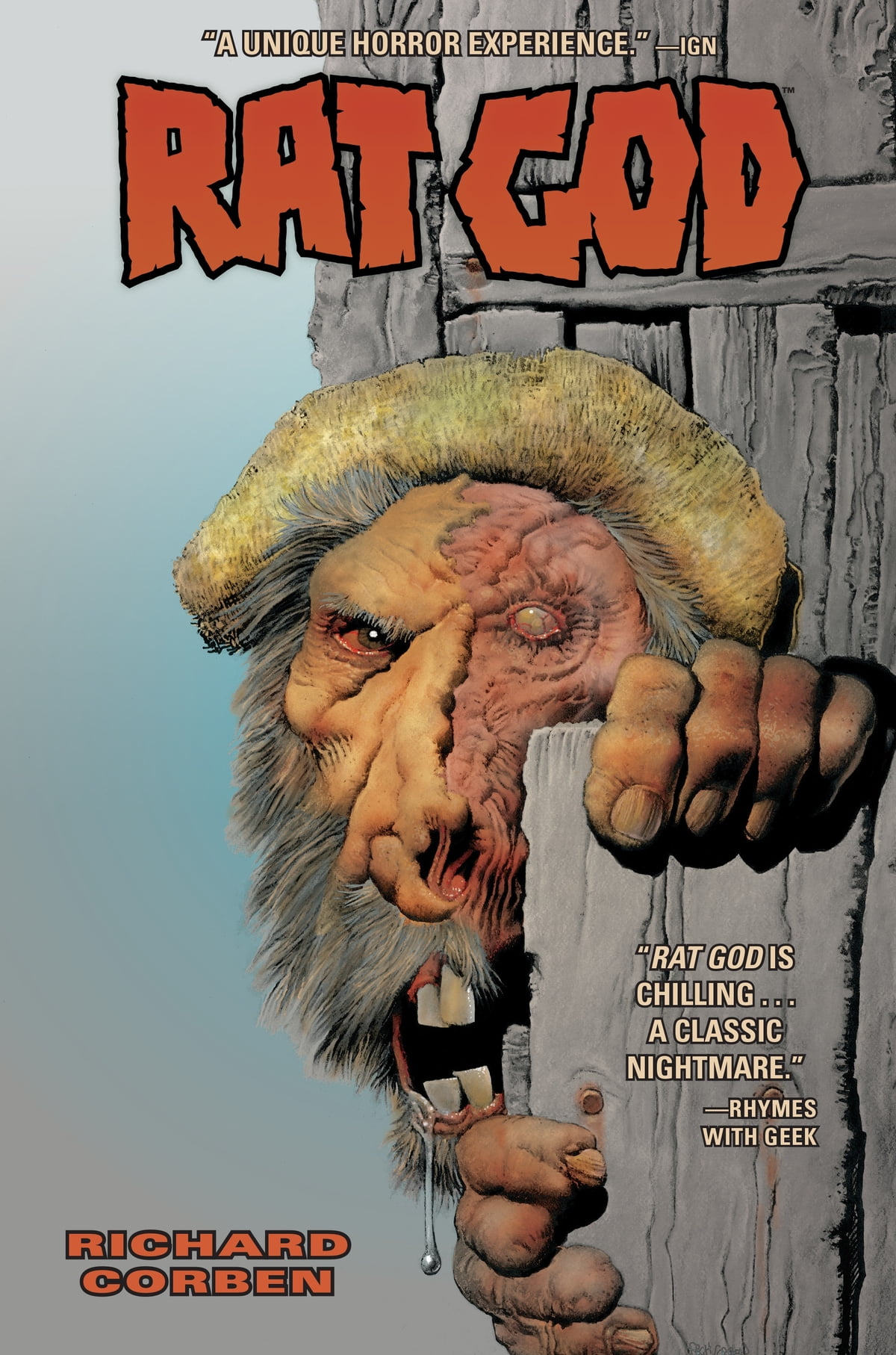
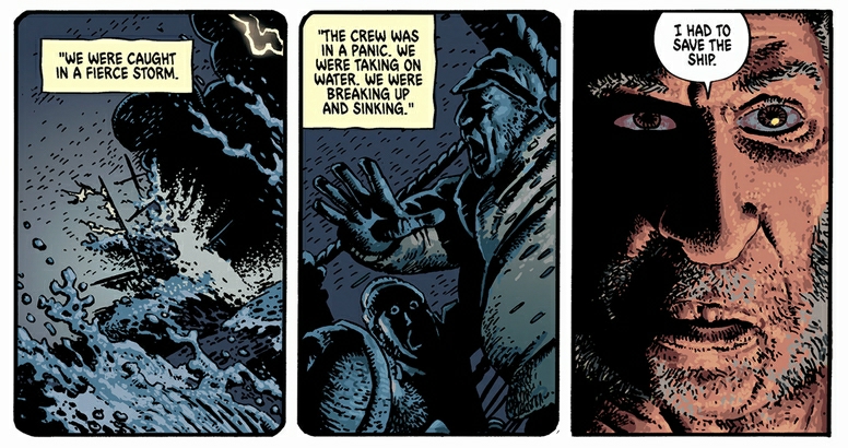
I believe here with Corben’s work, there was another consistently solid example of the narrative and art working in synergy so very well. He created a vast body of work across his long career and he was massively prolific, and managed to always create stories which appealed to a wide variety of audiences : horror stories were always the genre he enjoyed most personally though and I believe it was due to his love of dramatic and jarring lighting. A testament to this is that he chose to create a whole series of adapted Edgar Allen Poe short stories and they all had the expected deep shadowy worlds, all fantastically rendered and paced.
I’ve managed to amass a fair collection of Corben’s work, from the very early to his last and I read them constantly because they are just so good on every level. It’s no accident that his name often comes up with any mention of fantasy or horror genres, even more so posthumously as new audiences are introduced to his work.
Like many other readers and admirers of his work, I was lucky to have corresponded with Corben via email several times and grilled him about very specific aspects of his techniques and he was always very forthcoming and helpful, and very humble in the way he would play down his talents. A truly sad loss, but his legacy is huge and he’ll always be remembered as one of the great pioneers in mature comics.
_________________________________________________________________________________________________________________________________________________
Image references:
https://www.brokenfrontier.com/hocus-pocus-2-seance-collver-worth-watts/
https://skepticalinquirer.org/2020/06/hocus-pocus-bringing-skepticism-to-new-audiences-via-comics/
https://www.theguardian.com/culture/gallery/2011/oct/30/ten-best-graphic-novels-in-pictures
https://www.pinterest.co.uk/pin/484066659923581546/
https://en.wikipedia.org/wiki/V_for_Vendetta
https://www.otakusmash.com/read-comics/V_for_Vendetta_(1988)/
https://raggedclaws.com/tag/haunt-of-horror/
https://www.amazon.com/dp/B01663UKHC?ref_=cmx_l_ur_u_u_bs
https://raggedclaws.com/home/category/edgar-allan-poe/


![charlottesweb (12)[2]](https://i0.wp.com/wellisocartab.wordpress.com/wp-content/uploads/2023/01/charlottesweb-122.jpg?w=383&h=433&ssl=1 "charlottesweb (12)[2]")
![charlottesweb (4)[2]](https://i0.wp.com/wellisocartab.wordpress.com/wp-content/uploads/2023/01/charlottesweb-42.jpg?w=303&h=433&ssl=1 "charlottesweb (4)[2]")
![charlottesweb (9)[5]](https://i0.wp.com/wellisocartab.wordpress.com/wp-content/uploads/2023/01/charlottesweb-95.jpg?w=342&h=433&ssl=1 "charlottesweb (9)[5]")


_-_c03757_07.jpg)
_-_c06544_04.jpg)