Research point : Papercraft

In this Research point, the aim was to look at illustrators and artists who use paper as a medium rather than just a surface.

It seems upon researching this area that there’re seemingly endless and creative ways In which artists use paper and card to create pieces.

Click on each artists name to see further work.

Jodi Harvey

Artist Jody Harvey uses paper from hardback editions of books to create lovely paper sculptures featuring the characters from the particular book chosen, giving the impression of a 3D narrative bursting from the pages.

These are brilliant, they capture the imagination really well and they’re full of character. The use of each book in this way is really imaginative and it’s a clever alternative use of narrative through paper to give a condensed overview of the story. These look like they would work perfectly for the stop motion animation genre.

These pieces look as though they have been meticulously cut using a very sharp knife, I assume they’ve been patterned somehow beforehand like a garment then glued in places, although many areas look as though they are deviously folded somehow in a way which adds an appearance of layered thickness. I suspect that a stiffening agent has been used on some of the more fragile areas, maybe a PVA solution to add some rigidity.

Isobelle Ouzman

Isobelle Ouzman’s work is intricate and decorative and reminds me of Art Nouveau in it’s styling. The use of carved depth and drawings to create an optical illusion is superb and the highly decorative nature of the illustration adds a nice bygone sensibility to each piece. This artist has a recycle ethic in that she rescues unwanted books that she is given or comes across in second hand shops.

A small clue as to how these books may be constructed is revealed when they are viewed at a more oblique angle : the illusion of depth looks as though it’s achieved by gluing together a group of pages, cutting out the first aperture, then repeating the process with an ever decreasing hole until the desired depth is reached. Whether the illustrative aspect is first created then the hole is cut around this I’m not certain, I think if I were approaching something like this I would do it that way for accuracy. Either way, it looks very painstaking and  the results speak for themselves. The finer transition in some of the examples must take a long time and It looks to me as though all the pages are painted beforehand so they can be drawn upon. Superb result whichever method they’re created with.

Morgana Wallace

Here, the artist uses paper collage accompanied by watercolour, along with pen and ink in places. It’s quite difficult to discern from these flat images but there are layers of depth in the images as each layer is stood proud of the last, giving a nice 3D parallax. These paper creations have a modern feel yet they curiously feel traditional in their style too, almost reminiscent of European folk art from the 19th century.

From looking over a selection of these images, I’m reminded of marquetry, the difference here being that there are layers with increasing relief applied which adds depth. I really like how many of the images are vignettes on plain backgrounds, these have a lovely detached and other worldly narrative quality where there’s nothing else to clutter them, making them very impactful.

I wondered if they were created from a reverse tracing and cut out with overlaps which could allow for the layering element. There definitely seems to be some evidence of creasing and scoring happening in places, the cloth effects are great when combined with the mixed media. I get the impression that good lighting plays a part in showing off the best of these kinds of relief images where there are shallow details which cast slight shadows.

Conclusion

These were just a few examples of the many different kinds of paper craft out there, ranging from fully three dimensional, to deep relief and shallow relief. Some amazing examples and very inventive ways of using paper as a medium. While I was taking Level 1 Illustration, I experimented with pop-up, which is a kind of paper craft, although not strictly in the sense of these creations shown here. That was great fun and challenging, It took me a few cracked eggs to make that omelette in the end, but it was worth it and I was quite happy with the result there.

Image references:

https://www.jodiharveyart.com/

https://isobelleouzman.com/

https://morgana-m-wallace.tumblr.com/

Research Point : Interview with SpZero76

SPzer076

As a bit of an added bonus to the Street Art research point, I managed to grab an interview via email with an old work colleague Keith Hopewell, who goes by the professional moniker of SpZero76. Keith’s a very prolific artist, with murals and street art everywhere, and he’s now successfully publishing his own comic After the Robot Apocalypse. A self motivated freelance illustrator in every sense of the word, Keith very kindly took time out to answer a few questions, which are presented here.

How did you get into street art after we worked together in games, and how quick was the transition?

As you know I left Manchester and Code Monkeys after a break up and went travelling around Oz for a year. When I was away I got my first Facebook account, and on my return from Oz I found that I was back in Bristol in December in the cold, and my FB feed was full of friends, still travelling and living on beaches. It was at that point I decided to fill my social media with stuff I love…. art!

I’ve always been a fan of all kinds of art, including street art, which I got into when I saw The Walls of Fire event in Bristol, back in 1997, and I used to exhibit alongside street artists in the late 90s, despite never even trying painting until 2009ish.

On my return from Oz, I created a project called ‘Collaberation Nation’ through FB, where I invited artists to get involved. I wanted people from the street art world, as well as illustrators of all kinds.

I found that people were trying to put me in a box. I tried to get involved in an illustration project and they said I was too ‘street art’ (still before I had even painted a wall), so it was important to me to be inclusive.

The first Collaberation Nation only had 20 artists, mostly from the UK and featured some very big UK artists before they got big. Including MyDog Sighs and Hayley from Nomad Clan. By the time I got too busy to run the project it had 50 artists involved from around the World and featured in Digital Arts magazine.

Anyyyyyway! I met like minded artists, and we went out and practiced at least once a week, but luckily I got a lot of jobs through it, which paid for paint and allowed me to practise more. I joined a couple of Crews, including the ‘Lost Souls’ crew which got pretty big at one point, as we were painting London, all around the UK and even across Europe all the time.

This should have come first : tell us a bit about your career background

Ha ha! I think I answered that in Question! I went to University in Bristol from 1996-1999 to study illustration, but they always told me not to create street art or comic art. That’s my job now.

Was it something you always intended to do, or had you always done it and I just never knew!?

I never actually painted until after the Code Monkeys. not until 2009ish. I had the chance back around 2000, as I lived with an artist called China Mike… And if I had taken him up on that paint i would have painted amongst a bunch of artists, including Banksy. oops! I was too scared though. It was a new medium and it wasn’t as legal as it was when I came back to it later.

What sort of scales did you start at? Were you straight into the mural scale stuff or did you practice small then work up?

I learnt to paint with a good bunch, mostly painting hoardings in a skate park (Dean Lane. Famous for artists). Eventually we went on to bigger walls. It’s funny. It should be the other way around, as it’s easier to paint on bigger walls. You need tight lines on small walls.

Do you have a general process when approaching a piece?

I always design the piece beforehand, then hope it fits the wall. As I learnt to paint with loads of other artists, we got used to making things fit on the walls.

How did you get involved with POSCA? (I’ve seen your illustration set all over the place!)

Posca sponsored Upfest Street Art Festival (i think they still do) and around 2010 when i was running the Collaberation Nation (i spelt it wrong on purpose. kind of) project, Upfest invited me to take over a room at the venue with the artists involved in CN. We were using Posca pens, while outside people were using spray paint, so Posca were interested in what we were doing. I met Jacob from Posca at the event and it all started back then.

Bristol has always been a bit of a draw (no pun intended!) for the street art scene (and arts in general of course), did this have a bearing on you relocating there?

It didn’t initially as Banksy and the street art scene blew up when I was already down there. One of the main things that helped it get big in Bristol was the Walls of Fire event in 1997, although John Nation and Barton Hill youth club back in the day really helped push it… until Operation Anderson tried to shut that down in 1989. I painted John’s garden a few years ago.

You’ve got a pretty unique style, would you cite any big influences in your work?

I’m inspired by everyone! Back in the day it would be Feek, Will Barras, Jamie Hewlett and all the comics I read.

How many places feature your pieces now?

I have no idea. I’ve slowed down a bit recently and usually pieces don’t last long in the street art world. Maybe ten… maybe more? Not sure. Probably more.  I always forget what I’ve painted.

Would you say social media has definitely helped your career in street art

Yes. Definitely. Painting places like Shoreditch were great (which we did a lot) for commissions and gaining new followers, but if you painted a skate park your wall may only be seen by 10 people. It didn’t matter with social media as at my height I was getting over 500 likes a post… now I’m back down to 30-50 if I’m lucky. Algorithms!!! (shakes fist).

How did you get involved with releasing a comic series : was it something you had on the back burner and needed to find the time, but was always something you intended doing?

If you asked a young Keith what he wanted to be when he got older, he would say ‘Comic Artist’. I grew up reading them. Heading to the market and buying all the cheap crappy ones (couldn’t afford the nice ones back then) gave me loads of inspiration.

I always wanted to create a comic, but never had a story of my own, and it’s so much work. Back when I was part of a paint crew we all painted very cartoony characters that we fit together.

As I started solo spray painting more around 2016ish, I started to paint walls with a ‘scene’ that looked like it was the cover of a comic. I wanted people to be able to look at the wall as though it was the cover of a comic. They mostly featured humans in a post apocalyptic world on motorbikes. I wanted people to imagine the story, but I ended up painting loads and eventually I was like!!!! “Hey! I wanna tell this story!”

It’s a hell of a lot of work creating the comic all by myself. I did the illustration, colours, created my own font, logos, fake adverts, design, wrote the theme tune (haha! Not yet!). It doesn’t make much money but it covers its costs, and it’s what I always wanted to do. Young Keith would be proud 🙂

Trying to get 1 Issue a year out is a lot though so I’m looking to hire a colourist now. It will be a ten Issue story, so I have another 8 years plus ahead of me. (what have I done!!! ha!).

Do you have anything upcoming you can share (shows or new pieces, comic work etc)

The only fun paint I’m doing for the foreseeable is Cheltenham Paint Festival alongside Kid Crayon, but I’m also painting Kettle Black in Sheffield next week, and I have a big paint job in Bristol towards the end of the year… and of course there is Issue 2 of ‘After the Robot Apocalypse’. I’m at a bunch of Comic cons including Lawless in Bristol this weekend, Thought Bubble in Harrogate and The Lakes Comic Fest in the lake District. I can’t wait.

In Conclusion…

A lovely guy, he was great fun to work with and super talented! Here are some links to interviews and past works..

Interview with SpZero76 at Upfest

SpZero76 & CloakWork great Eastern Street London August 2016

Broad Canvas shop window transformed using Posca Pens by street artist SpZero76

Cheers Keith! 🙂

Exercise : Contemporary Ceramics

With this exercise, the brief was to create a range of illustrations for contemporary ceramics that draws on the visual history and symbolism of pottery in some way.

I chose to go with something along the lines of traditional Meso-American, specifically the Mayan culture here. I was limited with time again here so rather than produce a range of pottery templates such as cups, plates and saucers etc. I chose to go with a standard plate sized image here.

There was a slight learning curve again here as I knew I needed a final artwork which was scalable and lossless, which meant using illustrator to complete this design, rather than photoshop which would be limited to a final rasterized image.

Regarding the influence behind this design, it’s tin foil hat inspired : UFO and ancient aliens. I’ve always had an interest in the idea of aliens and the tantalizing (if very loose) connections which some make between ancient civilizations and the notion that they may have been influenced by someone or something from elsewhere off-world.

Recently my interest was re-ignited when a US whistle-blower came out with a fantastical story of how the Americans have hidden an extra-terrestrial crash retrieval program from the public for decades, on the back of the naval footage released a while back by the Pentagon which showed UFOs or UAP as they now coin them. (UFO by definition never implies anything off world, it’s generally accepted that it does however imply just that.)

Most Mayan iconography features strange sigils and totem imagery, a visual lexicon of hieroglyphs which consist of complete phrases or part sentences which change context when combined, much like any of the sinitic languages of Asia. Meso-American god system imagery generally consists of sky or flight deities, such as the Aztec god Quetzacoatl and these can be interpreted without much of a stretch as beings from another universe or planet system : especially by Shamans who are spaced out on mescaline or Psilocybin no doubt.

So to start, I gathered some reference for pottery and colour styles, and general imagery for glyphs.

reference

I wasn’t concerned too much with the meanings behind the glyphs as there are lots of them, I generally picked out a few which pictorially represented terms such as sky, sun, shield, god, spirit etc. just so I could loosely thread an iconic story together (of course if this were a live brief and it relied on accuracy that would require a sanity check via a genuine interpreter to be sure there was nothing blasphemous or offensive in the result.)

I began by simply creating a circle in illustrator which matched the dimensions of the plate I intended to create, which was the generally accepted European plate size of 9 inches.

Next, I created a series of glyphs which would generally describe man, alien, gods, firmament or skies, elements and hybrids, mostly images which would be enigmatic when presented in the context of Mayan culture and aliens.

plate pattern

The idea here was for the icons to wrap around the circumference of the plate and repeat if necessary. I took these drawings from photoshop into illustrator and used image trace to create vector shapes which were then converted into shape brushes. These can be wrapped onto path shapes such as circles.

Looking at pottery references for the Mayan culture, I then came up with a set of tileable and repeating patterns which I could use for backgrounds and trims.

plate pattern_3

plate pattern_2

A more specific and descriptive illustration was created in photoshop for the centre piece of the plate which depicts a pair of high priests or Shamanic priests beckoning skyward towards an extra-terrestrial craft in front of an altar.

plate pattern_centre

I took this into illustrator and converted it the same way into a traced image, then stroked path which could be coloured or manipulated further.

plate

So with a double repeat of the glyphs on the outer edge, an abstract background pattern and repeating inner, and the addition of some loose brush strokes to simulate oxide type washes, I arrived at this final result. The colour palette represents the mostly earthen oxides which seem to dominate many of the examples of Mayan pottery which have been excavated.

I believe this genre of concept would be fairly simple to reproduce into a complete set across other items of tableware such as cups, saucers etc. and the addition of an actual fleshed out and religion based narrative to adapt visually would probably give more illustrative credence to the result across a range of other crockery.

CONCLUSION

I have to admit I wasn`t really looking forward to this exercise in particular, pottery hasn’t ever interested me greatly in the past too much but as with the research task, this was actually pretty enjoyable ; as there wasn’t any interaction with anything physical such as cups or plates I think it’s the actual act of drawing which was fulfilling here, I should really experience transferring this to a real plate to see how it comes out and in fact the only thing which prevented me from having a go is the timescale again unfortunately.

I could never get my head around oxides and pigments changing colour so radically with ceramics, although I did work with flag printing some time ago and that was similar in that they were screen printed with powdered dyes which would totally change colour under a heat fixing process. (royal blue was turquoise for example and bright yellows were maroon).

I think looking at the glyphs this type of imagery would only perhaps suit a print or transfer process as the detail is probably too fine and fussy for hand application : or maybe not?

Research Point : Ceramics

In this research point, the aim was to look at a range of artists and illustrators who have used ceramics as a surface for their image making.

Pollyanna Johnson

pollyanna_Johnson

Pollyanna Johnson is a painter from East Sussex who hand paints onto ceramics. Her themes stem from an interest in 16th and 17th century ceramics and her own experiences as a female artist in what’s sometimes regarded in certain areas as a male dominated field. Her often whimsical takes on classically themed portraits have an underlying feminist message which is presented in a wryly mocking and quite subtly clever way. I particularly like the vintage feel to this piece pictured here.

Grayson Perry

Multi-disciplined artist Grayson Perry’s ceramics are quirky and feature mixtures of line art, collage and what appears to be decoupage, often including pop iconography, social commentary and art critique, along with auto-biographical sketches featuring his cross dressing alter ego Claire. His work is instantly recognizable and he has a very signature style.

Jayne Seymour

Jayne Seymour is a ceramics artist originally from Suffolk but now residing in Country Clare in Ireland. her work features figurative work and studies of crows which are a particular fascination. She creates each study directly onto unfired clay then adds shades gradually using oxides to build up the final results.

Jane Cox

The work of Jane Cox is inspired by nature and landscapes. Her work features interesting abstract motifs with random shifted repeats, often with strong negative spaces. Some of her coloured pieces have an oddly vintage or Nouveau feel to them and these blue and green examples have interesting monochromatic colour palettes. The surface patterns are created using paper resists.

Conclusion

I came across quite a few different ceramics based artists in the course of this research task, the breath of pattern and design is extremely varied, a great many apply abstract designs and patterns but conversely many apply illustrative designs too so there’s a something to cover the whole gamut of surface patterns. The range of motifs also varies quite widely, which I concluded is in many cases driven by what inspires an individual artist as with most fields of art. A large proportion of the less abstract artists are inspired by nature, location, cultures, along with animal and human anatomical studies. 

I would hazard a guess and say that the visual language on many ceramics surfaces (practical ones here, such as utensils and / or containers) is iconic, which is perhaps where more abstract patterns lend themselves, although this of course isn’t an exclusive reserve as there are also many examples of figurative and more representational work such as that of Grayson Perry or Jayne Seymour.

I’ll be the first to admit that ceramics isn’t an area of art I’ve really ever investigated before : well not modern ceramics at any rate, so it’s been interesting to see what’s out there.

Image references:

https://www.pollyannajohnson.com/

https://www.royalacademy.org.uk/art-artists/name/grayson-perry-ra

https://www.janeseymourceramics.com/

https://www.contemporaryceramics.uk/makers/jane-cox/

Exercise : paper circus

In this exercise, the idea was to create a poster advertising a circus using only paper.

This sort of falls into craft, which isn’t one of my strong points, but on the plus side I have lots of coloured paper to start with!

Once again, time is against me here so all the ideas I had straight off of using hand made paper, such as tea/coffee stained newsprint etc. were out of the window unfortunately, and weren’t so appropriate here anyway, although I did start out with a few vintage themed horror based circus ideas which would have suited that more.

I’m not strong on graphic design and always wished I could apply design principles to projects such as posters to produce more dynamic results with projects such as this : although I can no longer accommodate graphic design along with the course through an elective module etc. I do actually have a Udemy course in the subject ready to go on the back burner which should be a help.

One thing I have observed through looking at more posters over time, are the over arching principles of grabbing people’s attention by using graphic, colour and text. With this project I thought I would try and achieve that ethic by using colour and shape as primary considerations rather than anything fussy and illustrative first and then trying to consider anything communicative afterwards.

After settling on the final idea, I went into Adobe Illustrator and created the layout for the ball, seal and spot light. This was a very simple task, the ball was about as complicated as it got and this was achieved by wrapping a flat striped layout onto a 3D ball then picking the most desirable angle for my layout needs.

Once this was created, I loaded up the result into Photoshop and scaled this to fit into A3, then printed this out onto two sheets of A4 and taped the result back together to re-create the A3 layout again.

From there, I created a tracing in pencil, then used this in reverse to trace each section out onto coloured card and paper.

wip_02

The wider spot light beam at the bottom gave me the space to add in text, and the lighter background colour here would work to my advantage too.

wip_01

As a last minute change, I decided to use fluorescent card colours for the ball to make this stand out even more. It worked, but in the final image I’m not sure whether or not it actually overpowered the white text I intended using. Cutting all these pieces out with a scalpel was a bit tricky, some of the sharper ends were out a little bit, but thankfully it wasn`t too distracting.

poster_Final

This is how the final layout looked. Everything is created from card at this point, the smaller text would prove too time consuming at this stage to cut out and place individually, so I cheated a little there and added the extra text using photoshop.

poster_Final1

I left out the location and time here just so I could see how this worked with a minimum of text at the bottom. I think as a whole it was reasonably successful in that it’s attention grabbing through the use of larger, simpler text and simple shapes.

Conclusion

In terms of fulfilling the exercise criteria, this isn’t going to win any prizes for originality or imagination : I think for that I would need more time to abstract the brief into something more fanciful or with more paper craft virtuosity for example. Many of the pieces I saw in the research section were fantastic, but looked as though they needed a lot of time investment in them, particularly the more sculptural pieces.

Here, I’ve created a poster from paper which could have just as easily been created using any other flat medium which feels like a cheat in some respects.

I think splitting each layer off in this (such as the ball, the seal, text etc) and mounting them on separate pieces of card then creating physical distance between them and photographing the outcome would have worked much better, but I don’t have the luxury of time at this stage for that unfortunately, which is a shame as that would fit the brief much better I think.

I’m not going to beat myself up too much about this though, I created a loud and colourful poster in the end!

Exercise : Street Art

In this exercise, the aim was to produce an idea for a piece of Street Art. I was greatly inspired by what I had recorded in the research point for this and I’ve always liked old school Graffiti : I used to see superb examples everywhere and often wondered how they even managed to knock up such great work without getting caught by the Rozzers.

Having looked into Graffiti artists more online, their methods and the tools they use, I was itching even more to have a go at a large scale. Unfortunately with time against me once again, I had to resort to trying out some smaller scale efforts in my sketchbook. I created a pure ref mood board with a variety of different styles to inspire. This was a bit nerve wracking as I have to confess I’ve never been great at hand rendering lettering : would this work out differently due to things being more illustrative and less shackled by some of the more orthodox font rules?

graff_mood

I tried to categorize these into sub groups, starting with Wildstyle, one of the typical old school New york City styles you might see on subway transit cars in the 1970’s onwards.

After looking over some of the pages related to Graffiti / street art and seeing how artists plan out their works before scaling them up out in the wild, the nearest tools which I had to hand that could give me the look I was after were Posca markers, which had nice bright colours which were opaque enough to layer over one another regardless of dark or light.

For a subject, I chose my online handle which is Fester and I thought might make for a quirky piece.

I didn’t want to be particularly precious about this process, so I did no planning at all, I let loose with a fine liner just for the initial idea then outlined with fat or thin Posca markers, depending on what I wanted to try achieve.

Fester_02

This was my first go, which I was pretty pleased with given I’ve never done it before.

Fester_07

Attempt 2, I liked this type style..

Fester_04

Another attempt. The letter E is quite hard to read here and comes out more like the letter C..

Fester_06

This is a very common Graffiti type, I don`t know what it’s known as but I see this everywhere. it looks like it lends itself to fast completion with maximum impact, ideal for getting something up on a wall fast without much fuss.

Fester_03

I love the chunky and light hearted feel of this one, adding drips sets this off nicely too.

Fester_05

I enjoyed creating the previous attempts, but I was really after something I felt would be more appropriate to what I wanted from my own nick name / tag here. I was after something with a bit of a schlocky or low brow look, this sort of type was fitting, this one is quite hard to read though, probably due to the white inset outline around it all, black would have been a better choice here..

Fester_01

I created this without really thinking about any of the previous styles, it’s more random and has a more lowbrow aesthetic I think. The addition of toxic waste barrels enforced the lowbrow theme. I like how it turned out and I’d certainly like to try it out enlarged up to wall scale. Looking at the range of stunning colours available to street artists in aerosol cans, I don`t think it would be a stretch to make this appear very lurid on a wall!

As a side note, yellow Posca pens are no different to yellow in most other mediums, rather less opaque than you’d want and therefore needing a double layer more often than not. I was lucky here as mine literally ran out just as I had completed the last bit.

I snaffled a brick wall texture from the Adobe stock library and dropped this onto it in Photoshop with a small amount of opacity and colour balance fiddling just to see how it might look..

Fester_Wall

A little over bright here, but I think it might just work. I think if I were revisiting here for a larger scale, I’d be tempted to add a huge nuclear bomb mushroom cloud behind the logo to frame the text better and add more of an environment theme to it overall.

Conclusion

This was a rather surprising outcome here, I wasn’t overly enthused about re-visiting hand drawn lettering as I never really saw it as a strength, but I found this very enlightening and enjoyable! I’ve been scanning the street art supplies websites to price up a few aerosols and have a go at enlarging this at some point : It would be nice to see if I could search out a patch to practice on, I suspect it will be either on a community wall or worse case scenario, a derelict site which is probably known to be used by taggers.

Research Point : examples of Street Art

With this research point, the aim was to identify examples of street art on walls nearby.

As we live in a commuter village which is equidistant between Leeds, York, Tadcaster and Castleford, the scope for examples of street art is somewhat limited here : we certainly have graffiti, but it’s not exactly street art and it’s mostly limited to where the kids smoke Rock n’ Roll tobacco behind the local Co op store.

York is pretty much against anything that would deface the ancient city ruins understandably and anything remotely Graffiti based there would have to be sanctioned and would be strictly controlled and it’s also likely it would be part of an art installation or similar, although I’m sure there’s a shipping container area where there are street art decorations to attract people to the eateries there.

Coming from Leeds, I know there was always a healthy graffiti scene there which took on a huge popularity with the emergence of the break dancing scene in the mid 1980’s. I recently noticed an interesting wall display near an electrical wholesalers down near the River Aire, just outside the city centre and thought this would be a good place. It turned out there were steps there I never knew existed which led to a hidden gem under a flyover..

The steps were to the left of this first example, you can see the walkway handrails just to the edge, with a bollard with tags and stickers on. I took this sequence from left to right.

IMG_4975IMG_4977IMG_4978IMG_4979IMG_4980IMG_4981IMG_4982IMG_4983IMG_4984IMG_4985IMG_4986IMG_4987

I would hazard a guess and say that this space has been latched onto due to it’s vicinity in the evenings from prying eyes, but having said that the flyover is really busy so the risk of being seen by the police Is probably quite high. There’s the possibility that the artists crouch very low in order to be discreet, but I should think that would prove challenging as it takes a sweeping arm to create some of the styles. Of course there’s a possibility that the artists have been given permission and free reign as well. Either way, this looks stunning and brightens up an otherwise dull and lifeless area. It’s a shame It’s not visible from a car going over the bridge above. There was a wall opposite which had lots of faded tags daubed all over it, that looked positively scruffy at the side of this dynamic display.

Going down the steps to the river, I took these photos..

IMG_5003IMG_4988IMG_4989IMG_4990

A few of the pieces going down the steps were quite high up which made me wonder if these particular street artists had been given permission : I’m not sure how they would have reached there without a ladder..

Once I was down on the river bank under the bridge, there was a dazzling array of pieces on the walls either side of the water..

IMG_4994IMG_4995IMG_4996IMG_4997IMG_4998IMG_4999IMG_5000

On the opposite side of the river, there was a huge display of graffiti in one continuous image almost..

IMG_4993IMG_4992

As there’re walls all the way along the urban stretch leading into the city centre, it looked as though they were covered to the left of here heading back to the centre. I wish I’d had more time to take a walk right down into the city and photograph more, sadly I was on a time limit here but I’ll be heading back down there to capture the rest soon enough.

IMG_5002

Interaction with the environment

This particular selection was brilliant, there were a few old school styles mixed in there : I can see some New York influences through Wildstyle, a rather difficult text style to read but stylistically very technical and intricate, one I imagine takes some mastering and time to apply on a wall. There were tags everywhere, again somewhat hard to read sometimes. I didn’t really see any evidence of risky or heaven-spot graffiti as all the examples here were confined to vertical surfaces which were low down (large walls.) There’s an abandoned high rise office across the road however where somebody has sprayed POTEK below every window level (POTEK is an eastern European graffiti movement). There were examples of abstract and sharp which features angular and distorted lettering.

I got the impression here with this set of pieces that the wall was intentionally done to lead a pedestrian down the steps and into a larger gallery of work : it was quite cleverly conceived if so, and even though the art itself seems random with no general theme to it, each style has it’s own merits and diversity to provide a dazzling display : much better than just the grey toned dullness of an urban river bank. This contrast allows the art to pop furiously, adding welcome splashes of colour to the environment. I didn’t get the impression of a particular context to this work, perhaps with the exception of the Anonymous hacker image which made this piece feel entirely at home on an urban wall, given the anarchic imagery and subversive connotations of the group collective.

There’s a sensibility to street art which always gives me a taste of the New York City of the 1970’s, the five boroughs transit network covered in colourful tags and throw-ups, and the warriors style gangs that went with each locale. The fact that it’s considered disrespectful for one artist to paint over another’s tag brings to mind the gang warfare of NYC without the fighting, in the same way breakdancing and up rock did with rival crews (no accident that graffiti ties in with this subculture then.) Graffiti is interwoven with the same catharsis as street dancing, it’s an artistic outlet for frustrations which could otherwise be much more negative, so in my opinion there’s no way that graffiti could be considered vandalism. (the vandalism element to graffiti is when it generally isn’t executed well and it’s an eyesore at best, or at worst offensive in it’s content).

To conclude, an art form with it’s own terminology, styles and tools which have long outgrown it’s dark past of negative overtones : and one which can enrich and brighten the most dour of environments surely deserves it’s place as a unique art form.

Exercise : Pixelated images

In this exercise, the aim was to produce a series of illustrations that explore my own relationship to digital technologies.

Introduction

I’ve a long affinity with digital which started way back in 1983 with the first home computing boom, my first colour console being the good old Atari 2600,  progressing onto a Commodore 64, a machine I dearly loved for it’s slick (for the time!) graphic capabilities and amazing sound chip. The only machine which really topped this was the Amiga 500, a 16 bit computer custom made for games.

8 bit, Sprites and the evolution

I think I pretty much covered the computer side of things already in the research point, so I’ll try keep this to a less wordy sojourn into the evolution of graphics. The Atari 2600 was a hugely successful (now vintage) cartridge based system with an extremely limited memory and graphics capability, very rudimentary and primitive by todays standards. I only mention this here as it was my first video game system personally, and along with arcade machines of the time, this was the first console which fired my interest and set up my journey with digital graphics.

Although the 2600 was a great early system, you couldn’t do anything beyond playing games which came on cartridges (there was a peculiar membrane keyboard available which was non-standard and allowed for programming for the technical minded). My first serious computer was a C64 and this was the machine which allowed me to mess with graphics. This wasn’t the simplest machine to get to grips with compared to the other home computers on offer, and to get the most from the graphics you had to get your hands dirty and program some things..

sprite-sheet-image

This Excel sheet from Paul’s Notebook blog calculates the binary values for a sprite on a C64. If this sounds like black magic, it’s not : it’s tedious. Imagine Pac man, this would be one of the moving elements on the screen, such as the pac man or ghosts. To create one back in the day, you would have drawn this first on graph paper, then entered all the values here on the righthand columns into a string of data on the computer. Unless you were good at assembler programming, in which case you would make your own tools to draw these things and that’s how graphics programs evolved. There’s a working example with the code here if the inclination for a deep-dive hits anyone.

So as computing power has increased, we’ve moved on from these very limited grids of pixel dimension and limited colour to true colour displays which are in the millions and 4, 8 and 16K resolutions.

Pixel art however has never lost it’s appeal and is embraced more than ever as a quite nerdy and retro look, the reserve of nostalgic purists and graphic design geeks everywhere. In the games industry it’s adored by all to varying degrees, especially 2D UI (user interface) artists.

I’ve never lost my own personal fondness for it, and I can’t really explain what it is I even like about it, I do know It’s related to the vintage throwback to my early teens and that first taste of graphics and programming.

pixel-grid

This is a close up at grid level from photoshop of a piece of pixel art which I created one lunch time at work while I was looking for something to occupy myself rather than reading the doom-laden news.

Photoshop is a hideous program for creating pixel art in, the tools aren’t in the least geared up in any way for it, and beyond the pencil tool there’s precious little to manage palettes efficiently and easily. Something like Cosmigo’s Pro Motion NG is a much better proposition for creating pixel art, pixel animations and tile sets for retro games, plus it’s dirt cheap in comparison. Having said that, everything I present here was created using Photoshop, just because we have very limited access to other software at work.

These are pixel art portraits which I make up during lunch hours, usually if the weather is to bad too get outside..

face_09_Large

face_08_Large

face_06_Large

face_10_Large

face_01_Large

face_05_Large

face_03_Large

face_04_Large

face_02_Large

face_07_Large

These are all using limited palettes, so usually a few shades each for skin, hair, etc. Here, these are scaled up in photoshop using nearest neighbour so there’s no anti-aliasing smoothing applied, as this would ruin the clean pixel look by adding in smoothing colours all over the place.

For comparison, this is the actual size of the first image at the top..

head_small

Using limited palettes on early computer systems led to dithering, which is the process of laying down a chequer pattern of each colour next to each other to create an optical transition. When viewed at the actual resolution on screen, this can be pretty convincing in fooling your eye into thinking there are more colours than there really are.

I generally create these so quick I don’t bother to consider the contrast much so they often turn out rather flat like mugshots, which I’m not too concerned about really as they’re literally fun pieces.

JaneMansfield

This is a much larger image done in Photoshop, The ghost of Jane Mansfield. Disregarding the very dubious hand anatomy, this started life as a sketch, then a pixel outline, colours then shading.

This enlarged detail shows the pixel shading..
JM_enlarged
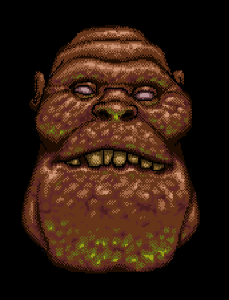
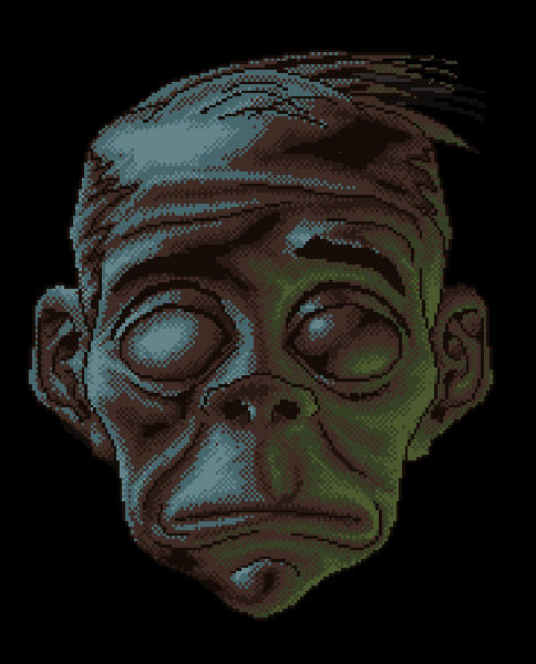
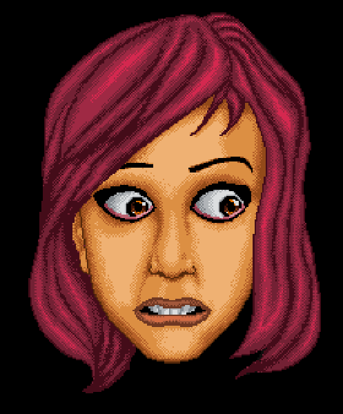
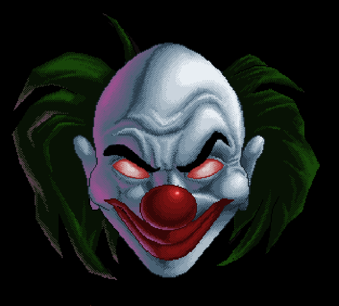
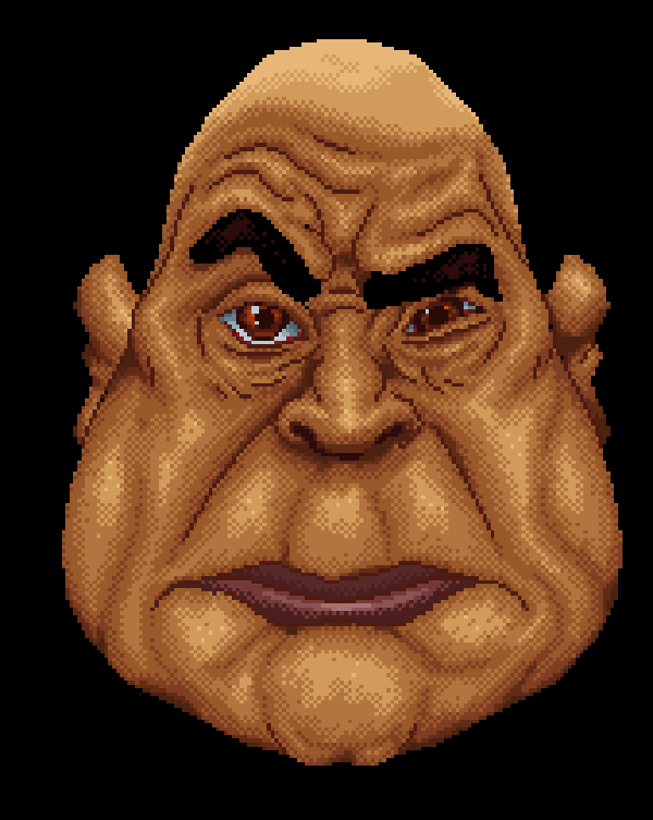
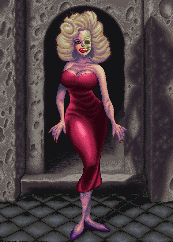
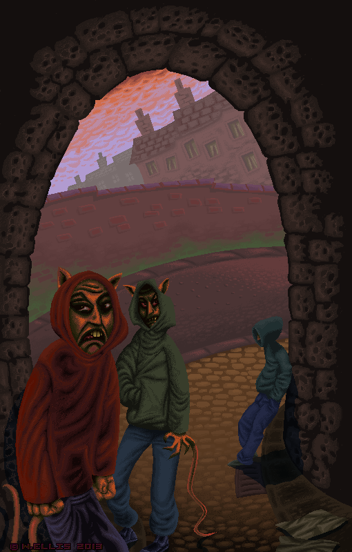
It might not impress the average person to know that unlike most other sane pixel artists, I hand place each dot in the image, drawing these in while looking at a real life sized (much smaller!) real time image as I go, so it takes a while : masochistic I know, but it’s a sure fire way to get into the zone in no time flat 🙂
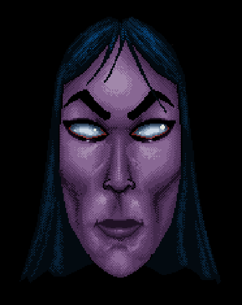
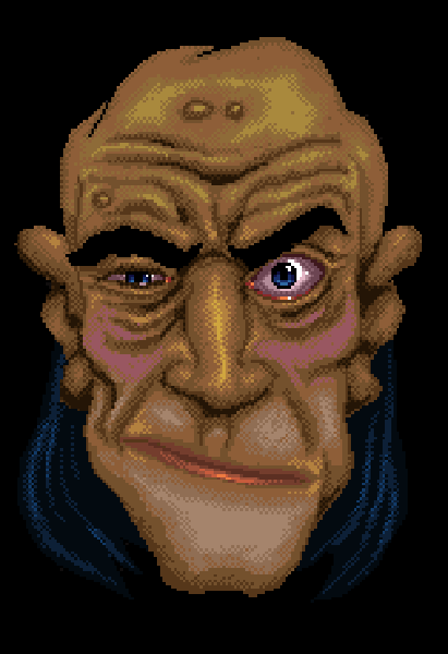
sewer rats

This is a pixel image from a long while ago, (2013?!) on the theme of Sewer Rats. I went for some aerial perspective in this, with muted colours at the back.

sewer_detail

These characters had quite menacing faces, they really represented the increasing armies of ne’er do wells which had been accumulating on the local street corners at the time, this is a pretty evergreen social issue which can be a good source of material for commentary through art, poetry etc.

background

On a final subject of game art, this is an unused piece I created for a very well know game a long time ago, which was released on the Nintendo 3DS. I was very lucky to have free reign on all the background art and the retro look was well received by the publisher as it gave a nod to the original game which this was based on.

background_detail

This is a more detailed close up with the pixel dithering in evidence. Each screen was taller than wider as it was scrolled vertically into place before the game started. This gave an overview to the player of what was either above or below their starting point. Here, there were a series of hot air balloons featuring either a character or some form of advertising.

Conclusion

This was a nice chance to revisit something which I still enjoy doing all these years later. I wouldn’t say it’s a lost art by any means, as I mentioned previously the resurgence in recent decades of retro gaming and graphics has re-ignited the whole pixel art style, It’s a bit of a painstaking way to flex my dot by dot muscles even if I do have to zoom the screen in further these days than I used to. Using limited palettes is a bit like real life painting, you have to be a little more creative in how you decide what to use where and when, without the luxury of even being able to mix them as you have a set number of colours and nothing in between (unless you choose a larger palette of colours that is).

While I was enlarging these images, it crossed my mind that something on a theme with these faces might make a good sticker set.. certainly one to try-out on the back burner!

Image references:

https://paulnotebook.net/tag/commodore-64/