This research task involved reflecting on my own work which I personally think says most about my own visual voice. I believe I fall somewhere between magical realism and a kind of low brow type artist, and my tastes in art reflect this.
This probably came about partly through an interest in comics from an early age : by comics, I mean the American DC giants such as The Witching Hour and The House of Mystery Thinking back, I was probably reading horror and mystery comics at such an early age I was becoming desensitized to them by the time I was in Middle school, but on the positive side, they turned me on to classic authors such as Poe, Shelley and Lovecraft.
In my teenage years I was inspired by artists such as Les Edwards, Prieto Muriana, Terry Oakes, Sanjulián : I could go on and on there were so many. In retrospect I believe it was the anatomically accurate covers which hooked me the most, the more pulpy and lurid they were the more they appealed.. the finest examples being those on Warren publishing’s triple bill of horror, Creepy, Eerie and Vampirella.
Themes
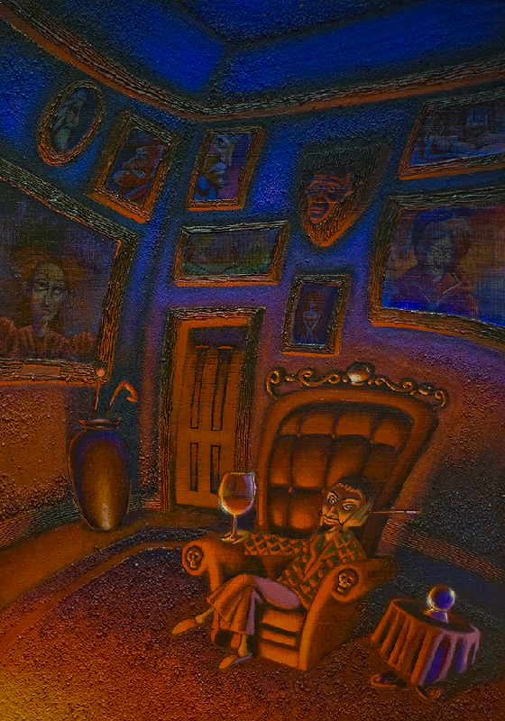
In terms of themes, I have an affinity with anything which is considered a bit `out there’ and i often try these out in different mediums. I had a stint of creating mixed media paintings which I managed to sell through a local gallery, on a loose theme of satire and the occult. Sounds like an odd mix, but visually they seemed to work.
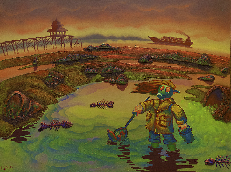
It doesn’t recreate very well here as it was rather noisy due to the layer of PVA and modelling gravel : it was also incredibly challenging to paint on using acrylics, this painting alone wore out more brushes than I’d care to mention.
This was also hideously dull and muddy in the end, not at all the vibrant contrast I was aiming for. I discovered this was in part due to the colour sinking into the base.
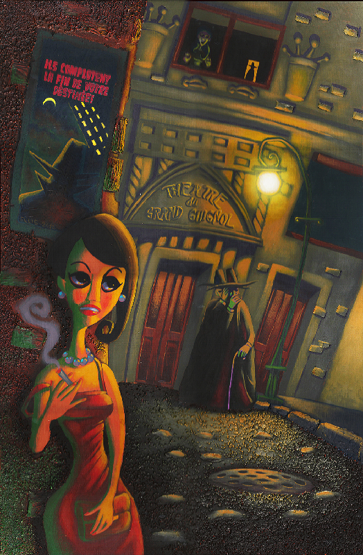
I created a painting based on the Théâtre du Grand Guignol which provided inspiration for a series, although i gathered plenty of ideas I’ve yet to get around to starting this.
This happens to a great many of the other artists I know, they have lots of ideas always on the back burner yet seem to struggle to bring lots of them to fruition : a curse and a blessing, you’ll never be short of ideas for a rainy day, but kick starting them can sometimes seem insurmountable.
Along the same style of mixed media, this was one of five images which started out as photoshop accompaniments to a short poem called the rain.
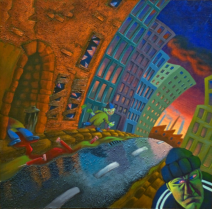
I was quite happy with the colour scheme on this, it was suitably discordant and lurid, and the texture shone through quite well.
This painting marked the end of my foray into mixed media in this way.. I found they just took too much time and I was working against the harsh surfaces. The raincoat on the figure was built up from layers of cereal pack cardboard then painted over : the rocks and barrels were bas relief style additions made from milliput. I did like the toxic colour scheme though.
This was a push at trying to loosen up my style a little more by studying painterly approaches. I set up the reference for this painting and worked from a photograph using oils. This was also an attempt at using a limited palette, after seeing an incredibly useful and informative video demonstration from Mark Carder’s draw,mix,paint channel.
This was a style with which I stuck with for a few years, although I hate it now, as it consists of very boring and overly soft edges everywhere with very few lost or found edges, or colour variations.
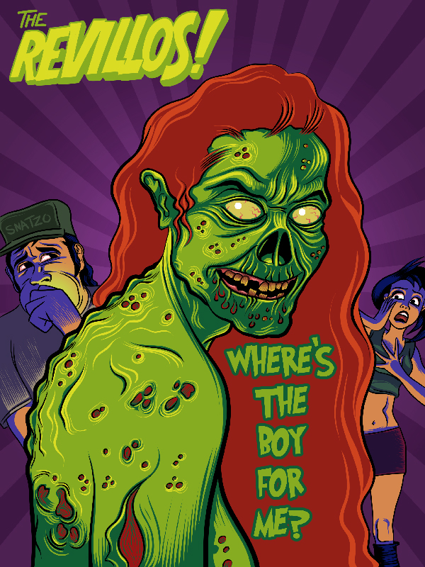
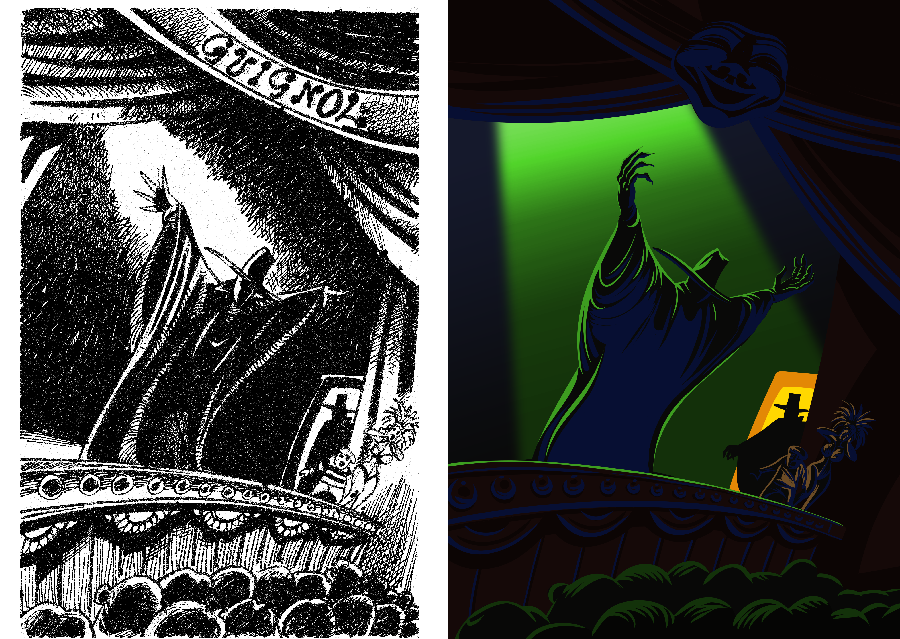
This particular style is one which I use often on the computer side, it’s a kind of halfway between linocut / etching with the elongated cut lines and comic art. It’s a graphic style and one which I would probably be better exploiting through illustrator rather than photoshop, but as these are personal works and i’ve no real need to scale them I don’t really see much point.
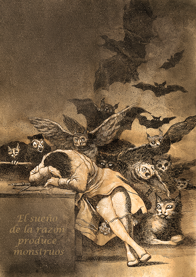
This was an exercise in trying to recreate one of my favourite pieces from Goya, the sleep of reason. I used tea stained paper (not good as it`s not archival!) sepia / white dip pen and ink and airbrush for the aquatint grain. I gave this away to a friend and he was pretty pleased with it : i learned a useful few techniques in the process. Art forgery might have accidentally been one of them.
Conclusion
It’s a tough call regarding styles as I don’t have a singular way of creating artworks. I have my definite favourites though and those are these..
Digital
i like these looser brushes for creating watercolour type effects digitally

I’ve recently been creating work in this more opaque looking digital style which I really like
Analogue
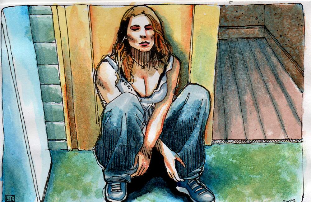
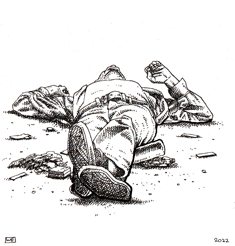
playing to my own strengths, I’ve always really enjoyed this hatching style of pen and ink work which I have done for a long time.
I started experimenting with watercolour along with pen and ink too, which adds some much needed colour in places : plus watercolour is about as instant and accessible as I could get for a wet medium.