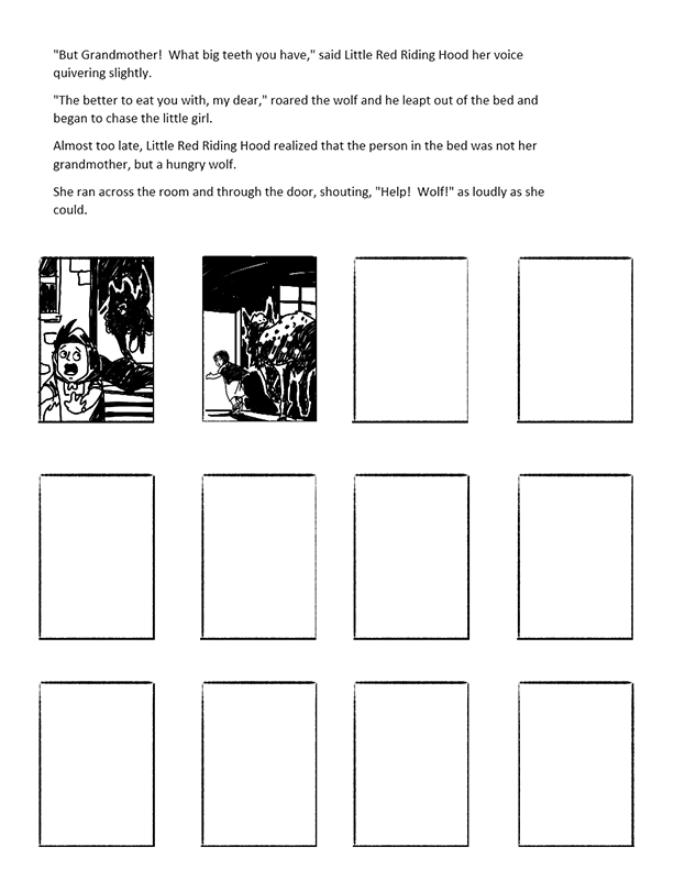
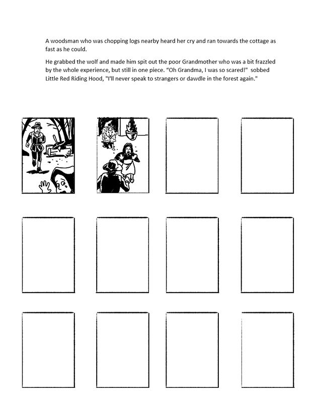
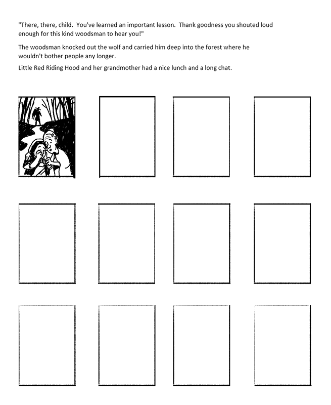
In this exercise, the aim was to produce a series of black and white images in response to a popular fairy story or folk tale.
I took a look at the classic tales here for this exercise, so after having a search around for texts based versions, I shortlisted Rapunzel, Cinderella, Hansel & Gretel and Red Riding Hood. I opted for Red Riding hood here as it’s an evergreen tale with a classic moral.
The version of Red Riding Hood I downloaded was by Leanne Guenther and It appears to have been sanitized and re-written to be a little more contemporary for younger readers, along with being condensed which suited my intention here with this exercise as there was very little editing. (by editing, I mean subjectively omitting certain passages to make the text physically fit on the page.)
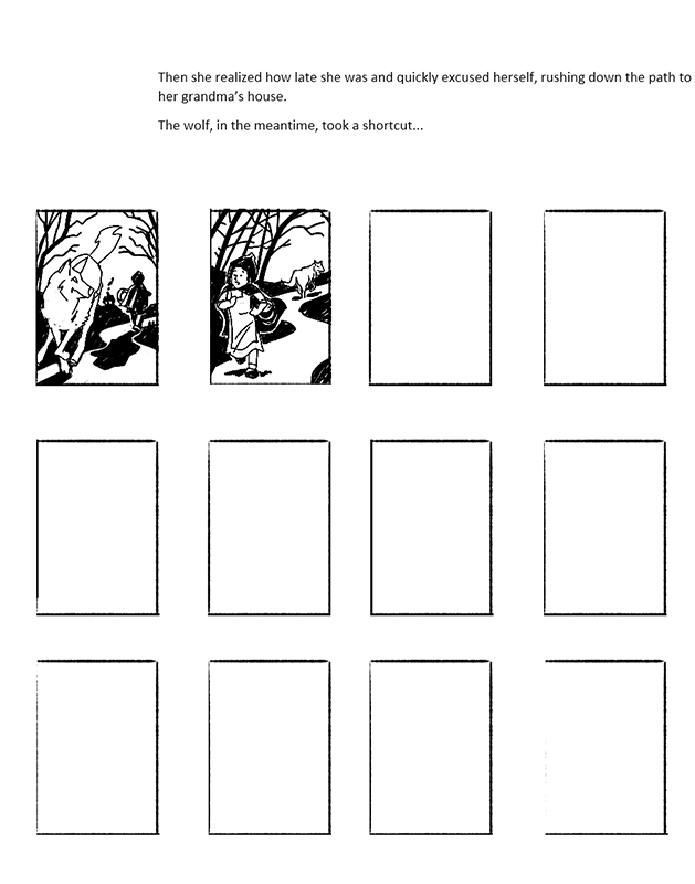
To start, the first thing I did here was to take the whole story then create the most convenient break points in the text. Some of these occur naturally through paragraphing, others can be determined through creating cliff hanger breaks, much the same way as breaking down comic scripts.
After the text was broken down, it created a thumbnail sheet which would hold the text for interpretation and a set of frames in which I could scribble out a rough sketch to experiment with visual layout to marry with the text in an attempt to make the best of both in a descriptive narrative : If the picture gave a decent overview of the text passage I was off to a good start. Some needed more work than others.
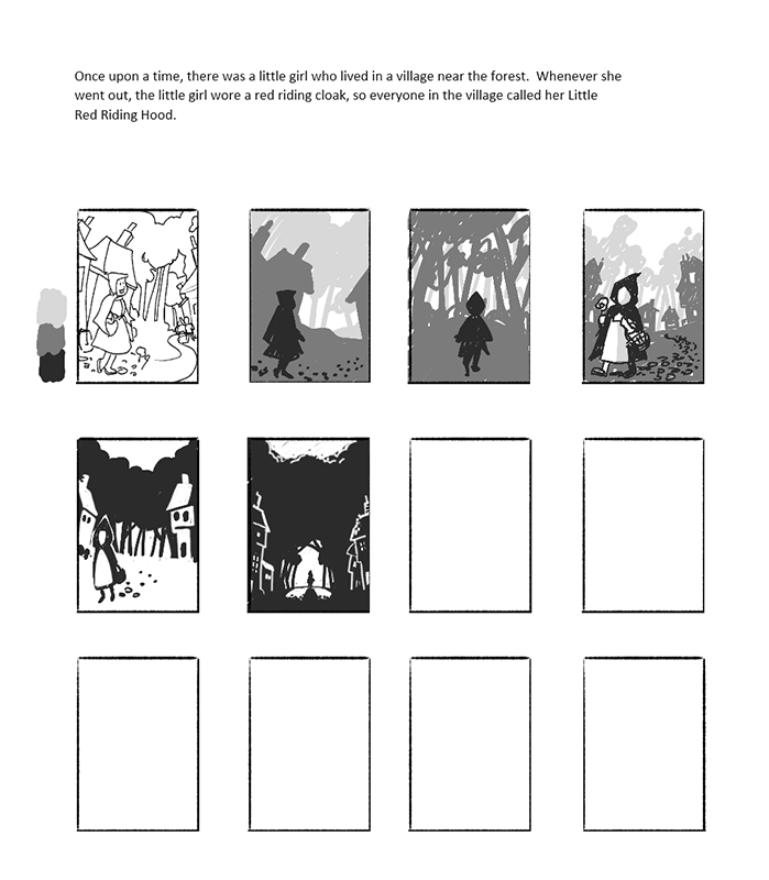
This was the first block of text and thumbnails. I started trying out planes in greyscale to see how planes would work, even though the final result would be black and white, as this helps me work out levels of shading. I would abandon this later in the process, as I found I could work this aspect out as I went along anyway, which saved me time.
The nice thing about thumbnails is that you can easily squint your eyes and just see abstract shapes : if they feel strong even with your eyes half shut and it feels like you’ve struck a good balance of light and shadow at that size, then that’s often a good indicator that there’s something potentially successful in there.
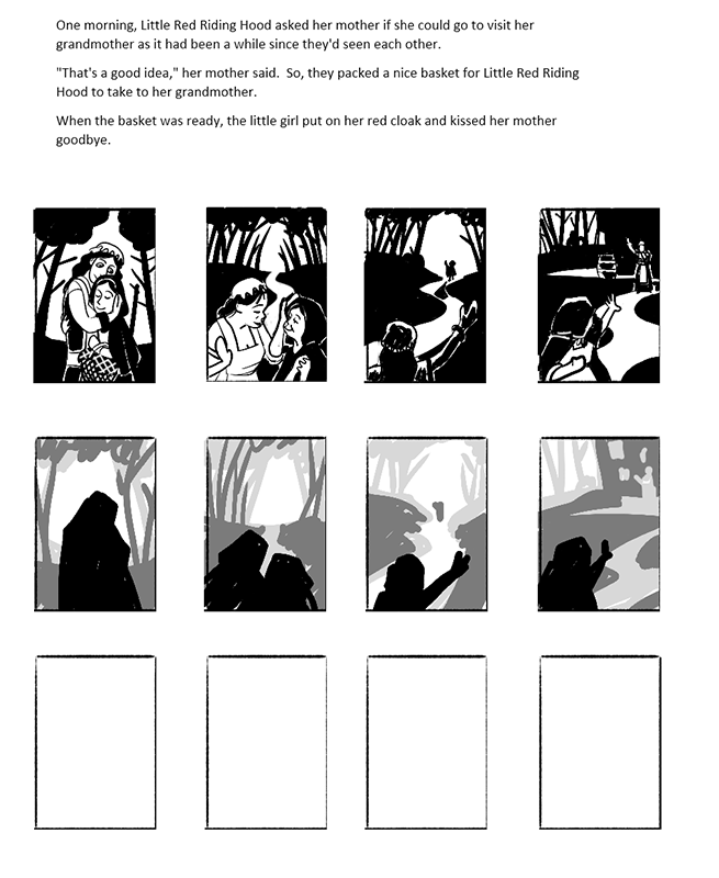
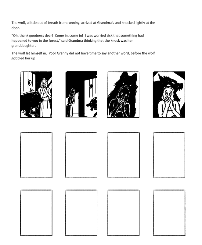
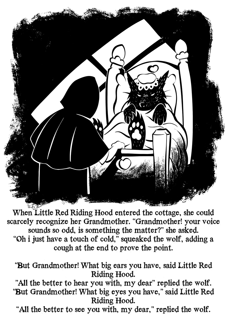
In some cases, the text dictated very much what could be portrayed to an extent, so if there was interaction between two or more characters, this would necessitate the clearest depiction of the subjects, so rather than try to be over fancy with camera angles as one might do in a comic strip, the aim here is to use a simpler narrative approach without being overly fussy.
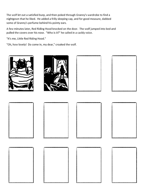
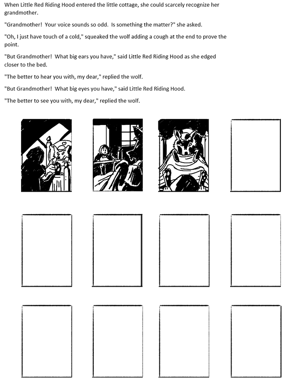
These were the resulting images after choosing from each set of thumbnails…
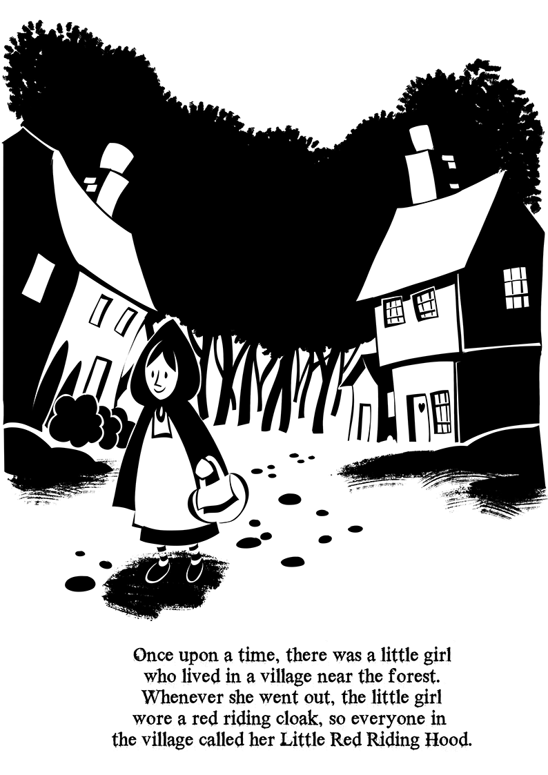
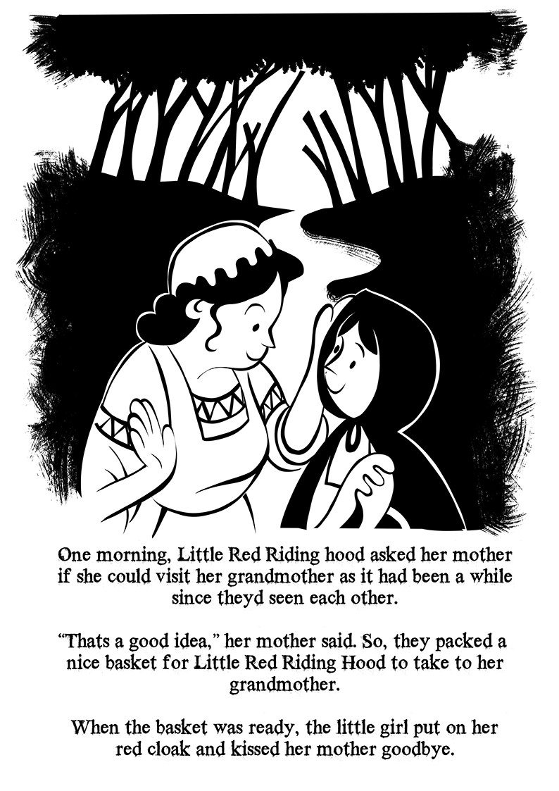
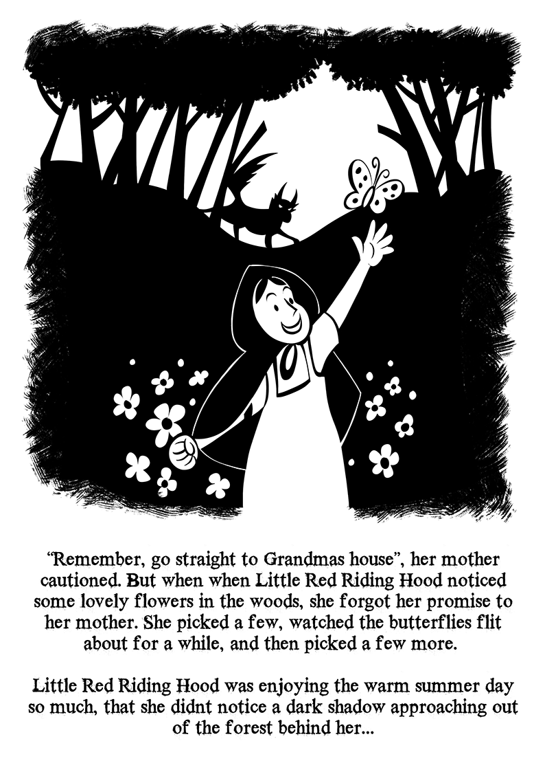
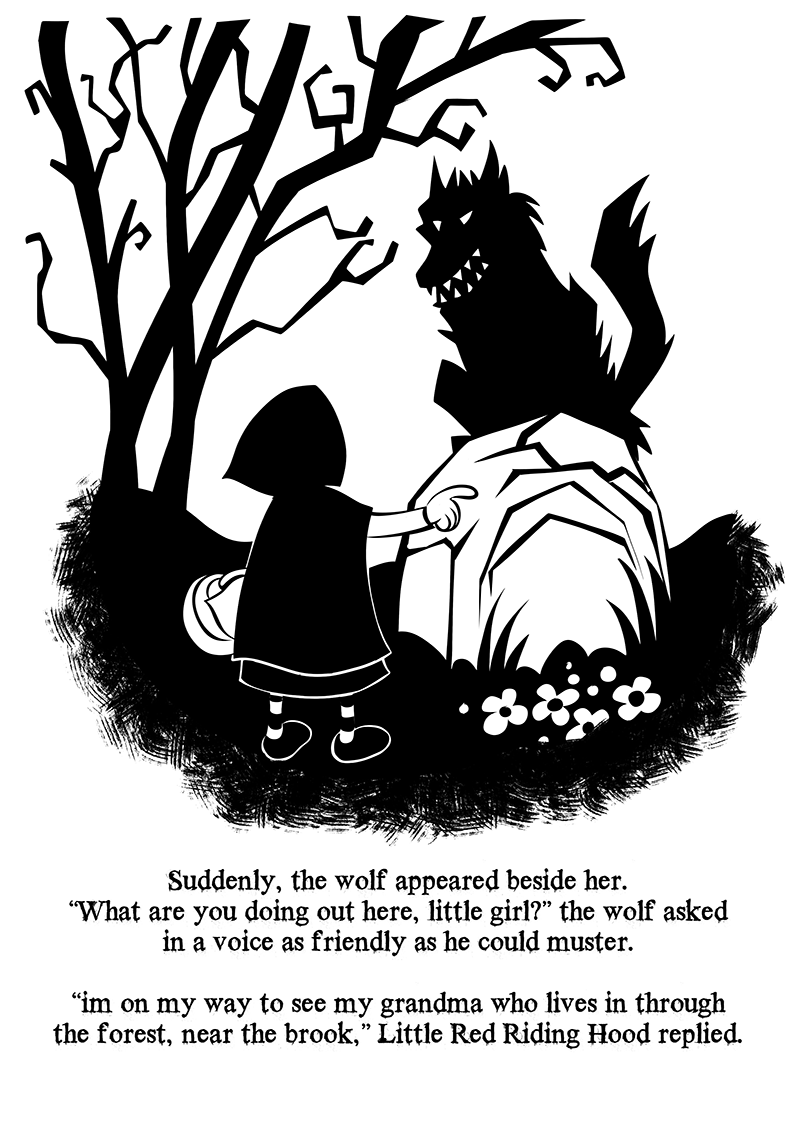
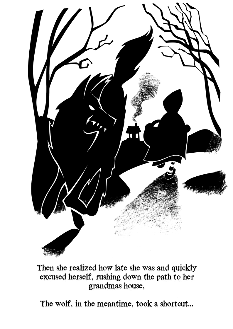
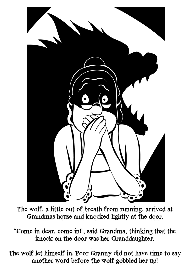
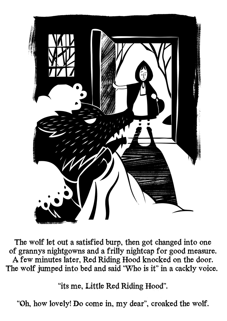
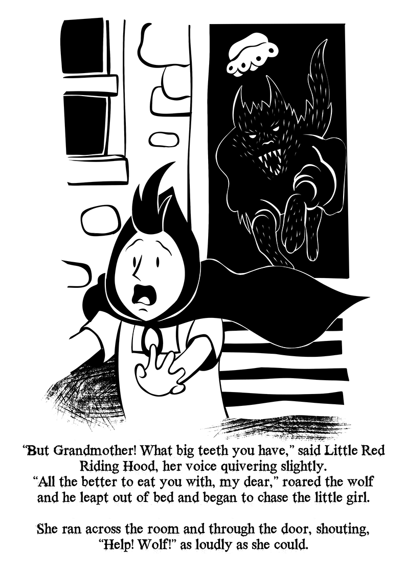
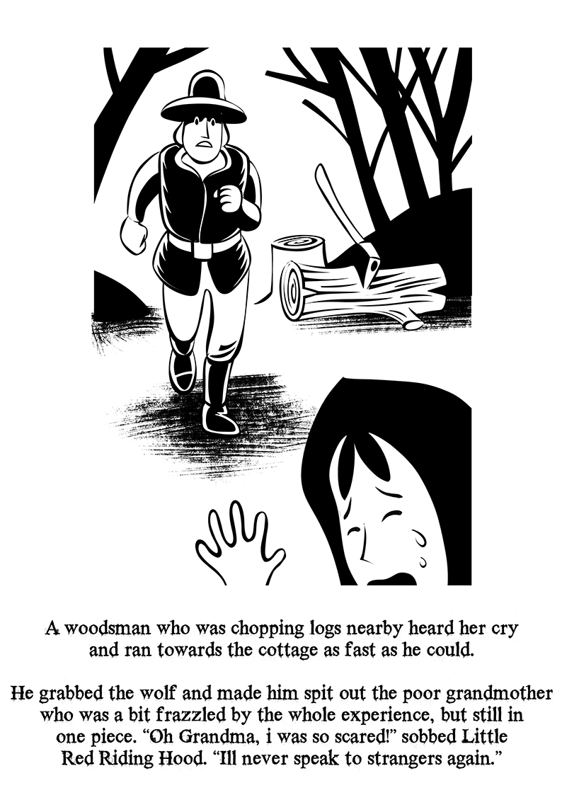
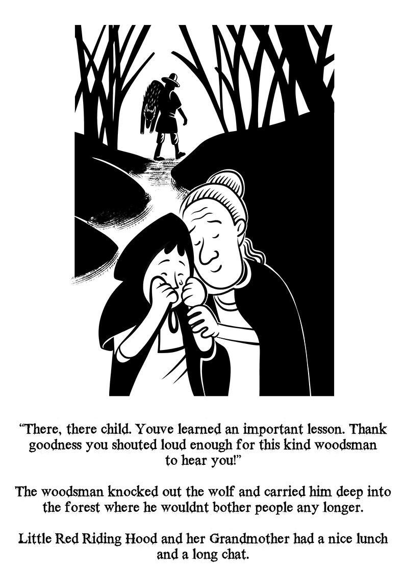
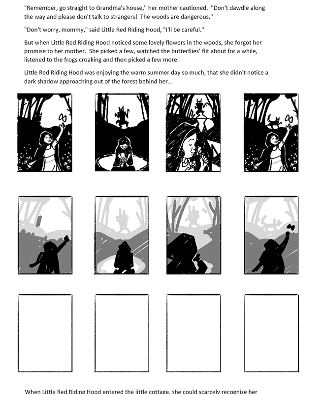
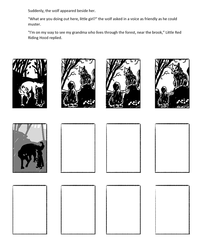
I went for a lino/wood cut look in the final illustrations as I felt this was sympathetic to the age of the original tale (brothers Grimm.) Adding a Vignette to the outer edge of some of the images allowed for a vintage and more traditional look, I did go for adding in some subtle shape language changes, so the trees at the start are quite benign looking and these become more gnarled and threatening as the encounter with the wolf unfolds. There was no assumption on the target age audience for this version, but I played safe and assumed it wouldn`t be a great idea to choose to show Granny being eaten by the wolf, although I’m sure I’ve seen slightly more graphic versions of this story even for younger folks.
Conclusion
I thoroughly enjoyed this exercise, it’s great fun taking a text and interpreting it into images to augment the story. My takeaways from this exercise would be, I regret not taking Graphic Design or Book Design as one of my elective modules earlier in the course, I think I would have benefitted from knowing more about either when it comes to working with text and layout.
I like working with text, but I feel I don`t know enough about how it can compliment imagery : I’d feel more brave using text in more exotic layouts which follow graphic shapes in the illustrations if I were creating something of my own or there was some suggestion from a client for instance. The result here in this exercise is that I’ve played it safe by using simple and somewhat vanilla and old fashioned layout with the text which Isn’t all that dynamic really, although it reads well enough. I tried white text against the expanses of black in each image, but I found this was dictating the illustration a little too much for my taste and it had a tendency to force the text to jump around in each image which was a little distracting and ugly in places. This is where more thought in the planning stage would have helped and I feel Graphic Design would have come in very handy.
Overall though, most enjoyable!
